How Are Biological Pathways Connected?
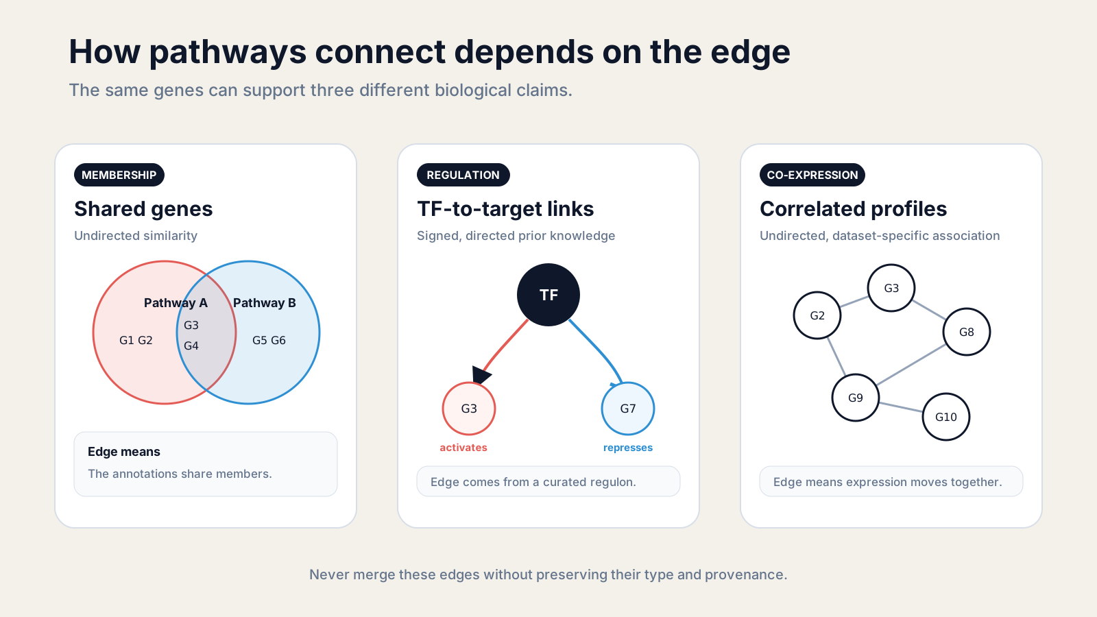
Biological pathways connect when they share molecular components, exchange regulatory signals, or show coordinated behavior in data. The connection is meaningful only when its edge definition is explicit.
A pathway map is not one universal network. One edge may mean shared genes, another may mean a signed transcription-factor target, and another may mean correlated expression across samples. Those claims are not interchangeable.
This guide shows how to define each relationship, calculate a pathway-to-pathway network, and interpret the result without turning association into mechanism.
How are biological pathways connected?
Pathways connect through shared entities and events, causal or regulatory relations, or data-derived associations. A defensible network states which of these created every edge.
Curated pathway boundaries are useful, but they are not walls around cellular processes. A kinase can participate in several signaling programs. A metabolite can feed several reactions. A transcription factor can coordinate targets assigned to different pathway collections.
Reactome’s data model makes this overlap concrete. Reactions link through shared physical entities, and one event may belong to more than one pathway. The database groups interlinked events into pathways even though those groupings can be partly conventional.
Four connection types are especially useful in transcriptomic analysis:
- Member overlap: two pathway definitions contain some of the same genes.
- Leading-edge overlap: the measured signal in two enriched sets is driven by some of the same ranked genes.
- Regulatory linkage: a curated regulator or signed interaction links components across pathways.
- Co-expression: genes assigned to different pathways vary together across the analyzed samples.
The first two start from gene sets. The third requires prior-knowledge edges. The fourth is estimated from the experiment. Mixing them in one unlabeled network destroys the distinction between annotation, mechanism, and observation.
How can shared genes connect pathways?
Shared genes connect pathways by defining an undirected similarity: the more members two curated sets share, the more their annotations overlap.
Let pathway A contain {STAT1, IRF1, CXCL10, JAK1} and pathway B contain {STAT1, IRF1, TAP1, B2M}. Their intersection is {STAT1, IRF1}. That edge says the two pathway records share two annotated members.
It does not say A activates B. It does not say the shared genes changed in your experiment. It does not even prove that the database curators intended the two records to represent one continuous mechanism.
Overlap still solves an important interpretation problem. Enrichment tables often contain near-duplicate terms because collections differ in scope, hierarchy, source, or curation date. Connecting those terms can reveal a coherent theme that a ranked list hides.
The Enrichment Map method represents gene sets as nodes and member overlap as weighted edges. Node color can carry an enrichment result, while edge width carries similarity. The channels remain separate.
Use stable identifiers and one gene universe before calculating overlap. IL6, an Ensembl identifier, and an outdated alias should not become three nodes. Record the pathway collection and release because set membership can change between versions.
For hierarchical collections, also ask whether one set is almost nested inside another. Plain Jaccard similarity can make a small child set look weakly related to a large parent even when nearly every child gene occurs in the parent.
What does Jaccard similarity measure?
Jaccard similarity measures the shared fraction of two sets: intersection size divided by union size. It ranges from zero for no overlap to one for identical membership.
For sets A and B:
J(A, B) = |A ∩ B| / |A ∪ B|If A has 40 genes, B has 50, and they share 20, their union has 70 genes. The Jaccard score is 20 / 70 = 0.286.
The overlap coefficient answers a different question:
overlap(A, B) = |A ∩ B| / min(|A|, |B|)For the same sets, the overlap coefficient is 20 / 40 = 0.5. It better exposes containment, while Jaccard rewards similarity in both membership and set size.
NotchBio’s focus neighborhood uses Jaccard for its displayed gene-overlap edges. Its redundancy collapse uses an equal-weight combination of Jaccard and overlap coefficients, which helps detect a smaller set nested inside a larger one.
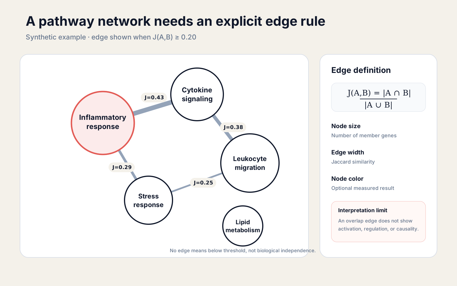
Thresholds control readability, not biological truth. A cutoff of 0.20 can produce a useful map for one collection and a hairball for another. Report the cutoff, inspect sensitivity, and export the unthresholded pair table when reproducibility matters.
How do leading-edge genes reveal shared drivers?
Leading-edge overlap connects pathways through the subset of ranked genes that actually drives each enrichment signal in the current comparison.
In GSEA, the leading edge contains members encountered before the running enrichment score reaches its extreme. The GSEA user guide calls this subset the core that accounts for the signal.
That makes leading-edge overlap more experiment-specific than full membership overlap. Two pathways may share 25 annotated genes but have only one shared driver in a treatment contrast. Another pair may share few total genes yet depend on the same three strongly ranked genes.
Keep the two networks side by side:
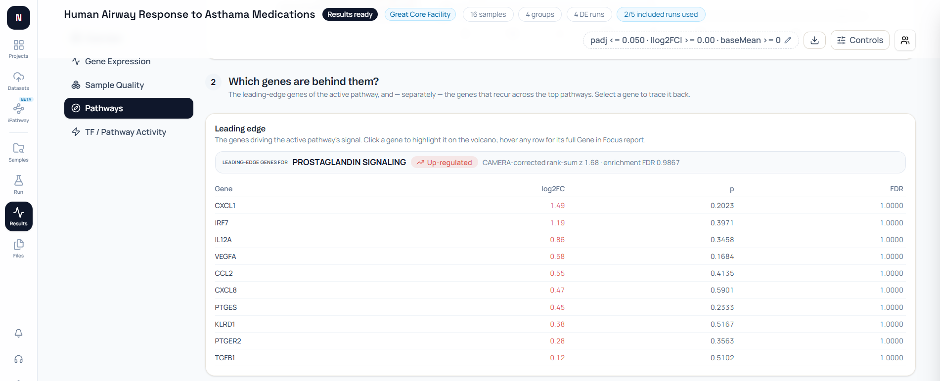
membership edge: all curated members shared by A and Bleading-edge edge: current signal-driving members shared by A and BA recurring leading-edge gene can explain why several terms rise together. It can also reveal redundancy: ten pathway labels may all be reporting the same compact interferon response rather than ten independent discoveries.
Do not promote a recurring driver to a master regulator from enrichment alone. Its repeated appearance means it contributes to several ranked-set signals. Directional control requires a regulatory model or experiment.
How do transcription factors connect pathways?
Transcription factors connect pathways when a curated, signed regulator-target network links one regulator to genes assigned across several pathway programs.
This is a directed layer. An edge runs from a transcription factor to a target, and its sign may describe activation or repression. Evidence and confidence can differ by target, tissue, perturbation, and source.
CollecTRI aggregates signed TF-to-gene interactions into regulons. Such a resource can test whether the observed movement of a regulator’s targets is consistent with increased or decreased regulator activity.
The pathway connection is then indirect but interpretable. If TF X has supported targets in pathways A and B, X is a candidate shared regulator. That statement is stronger than member overlap but still depends on the network’s scope and the experiment’s measured coverage.
Do not replace a target model with the TF’s own messenger RNA fold change. Transcription-factor activity can change through phosphorylation, localization, cofactors, or degradation even when its transcript does not move.
Keep regulator edges distinct from pathway-topology edges. A regulator footprint asks whether weighted targets fit the data. A signed pathway graph propagates perturbation through a curated molecular wiring diagram. They answer different questions.
Can co-expression connect pathway members?
Co-expression connects genes when their measured profiles covary across samples, creating a dataset-specific association network rather than a curated causal pathway.
Pearson correlation captures linear co-movement. Spearman correlation captures monotonic rank agreement. Both require enough independent samples and careful review of outliers, batch structure, library quality, and dominant group effects.
WGCNA is a widely used framework for turning weighted gene correlations into modules, eigengenes, hub measures, and trait associations. Its modules are learned from data; they are not automatically database pathways.
A treatment can induce high correlation simply because both genes differ between groups. Within-group correlations may be weak or opposite. Recalculate after appropriate adjustment when the question is co-variation beyond the experimental design.
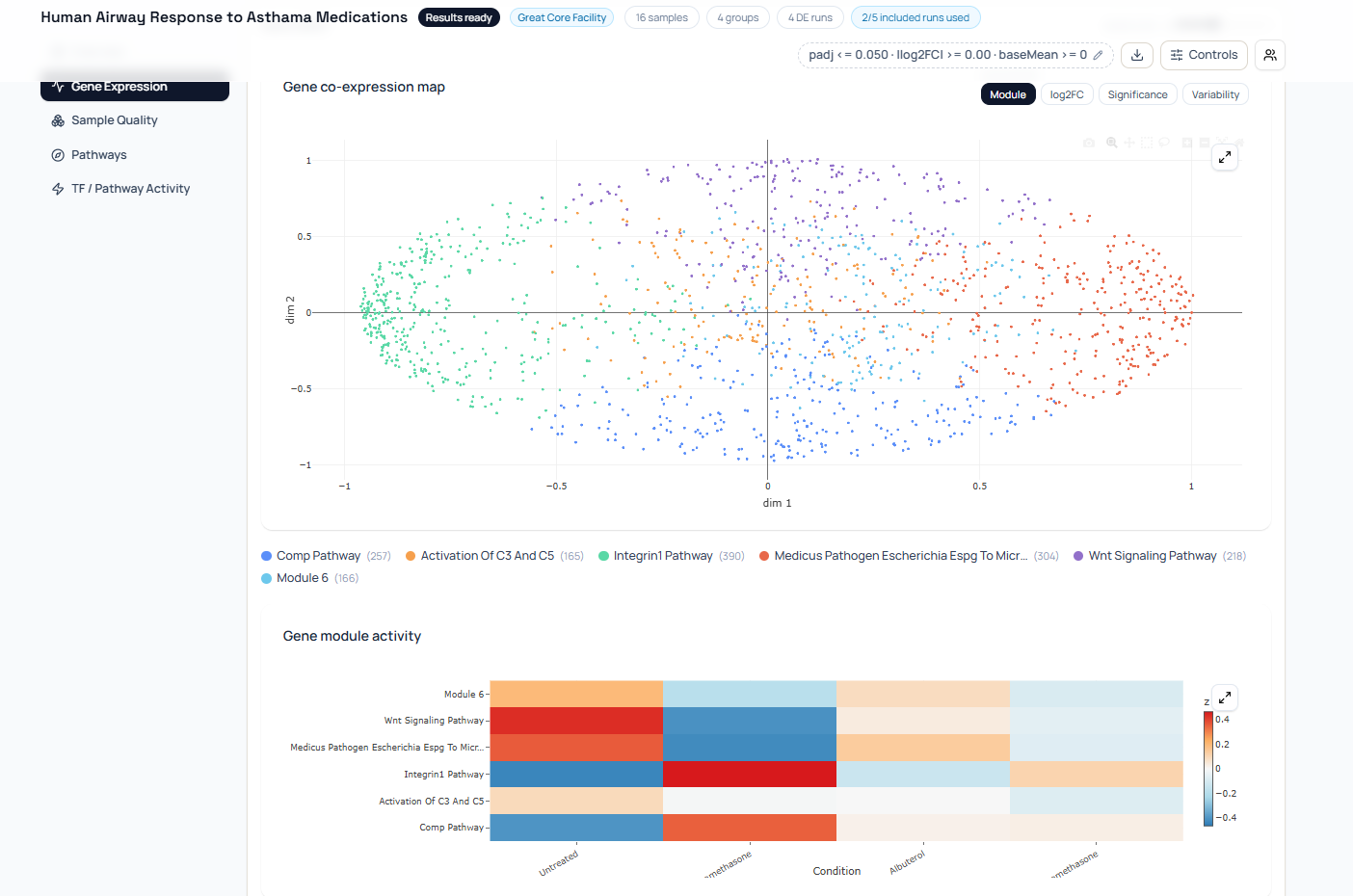
Correlation is valuable for hypothesis generation. It can nominate genes that share a state, uncover modules not captured by a pathway database, and show whether members of a curated set behave coherently.
Correlation cannot orient an edge or exclude a hidden common cause. A regulator may drive both genes, a cell-composition shift may move both, or a technical factor may create the pattern.
How do you build a pathway-to-pathway network?
Build a pathway network by defining nodes, one edge rule, provenance, thresholds, and visual encodings before drawing anything.
Start with a tidy pathway membership table. Each row should contain a stable pathway identifier, display label, collection and release, organism, and gene identifier. Then choose whether edges use all members or comparison-specific leading edges.
This deterministic Python example builds a membership-overlap network:
from itertools import combinations
import networkx as nx
pathways = {    "inflammatory_response": {"STAT1", "IRF1", "CXCL10", "JAK1", "NFKB1"},    "cytokine_signaling": {"STAT1", "IRF1", "TAP1", "B2M", "JAK1"},    "stress_response": {"IRF1", "CXCL10", "JUN", "FOS"},    "leukocyte_migration": {"TAP1", "B2M", "JAK1", "JUN", "FOS", "ICAM1"},    "lipid_metabolism": {"ACACA", "FASN", "SCD"},}
minimum_jaccard = 0.20graph = nx.Graph(edge_type="member_jaccard", threshold=minimum_jaccard)
for name, genes in pathways.items():    graph.add_node(name, set_size=len(genes))
for (name_a, genes_a), (name_b, genes_b) in combinations(pathways.items(), 2):    intersection = genes_a & genes_b    union = genes_a | genes_b    jaccard = len(intersection) / len(union) if union else 0.0    if jaccard >= minimum_jaccard:        graph.add_edge(            name_a,            name_b,            edge_type="member_jaccard",            weight=round(jaccard, 4),            overlap=len(intersection),            shared_genes=sorted(intersection),        )
print(sorted(graph.edges(data=True)))
Preserve edge_type in the graph and export. If you later add leading-edge or TF links, use a multiplex graph, separate panels, or explicit edge styles. Do not silently combine scores measured on different scales.
Node color can show a pathway result, such as directional enrichment. Node size can show measured set size. Edge width can show Jaccard similarity. A legend must state each mapping and distinguish missing results from nonsignificant ones.
For dense results, use an adjacency matrix or cluster summary instead of forcing every label into a node-link plot. The biological network figure rules recommend choosing the representation around the intended message and warn that layout can imply relationships not encoded in the data.
How should multiple connection layers be combined?
Combine pathway layers as a multiplex network: keep one node set, retain a typed edge table for each relationship, and compare the layers without collapsing them into one score.
A practical export uses one row per edge with source, target, edge_type, weight, shared_items, source_database, release, and comparison. Directed layers also need sign and a clear source-to-target orientation.
source target edge_type weight provenancepathway_A pathway_B member_jaccard 0.286 MSigDB release Xpathway_A pathway_B leading_edge_jac 0.125 contrast treated_vs_controlTF_X pathway_B curated_regulation 0.800 CollecTRI release Ygene_1 gene_2 pearson 0.710 24 adjusted samplesThe weights are not commensurate. A Jaccard score of 0.4, a TF confidence of 0.8, and a correlation of 0.7 cannot be averaged into a scientifically meaningful connection score without a validated model.
Instead, ask whether layers support the same hypothesis. A pair of pathways may share members and leading-edge drivers. A known TF may target several of those drivers. Co-expression may show that they move together in this dataset. Agreement raises a better hypothesis; it does not automatically establish causality.
Disagreement is informative too. Strong membership overlap with no leading-edge overlap means the current contrast uses different parts of two similar annotations. A curated regulator edge with weak target coverage means the experiment cannot evaluate the prior well.
Always keep missing evidence distinct from negative evidence. No available TF edge can mean the prior database lacks coverage. No visible overlap edge can mean the similarity fell below a display threshold. Neither state proves that the pathways are independent.
How does NotchBio trace shared pathway evidence?
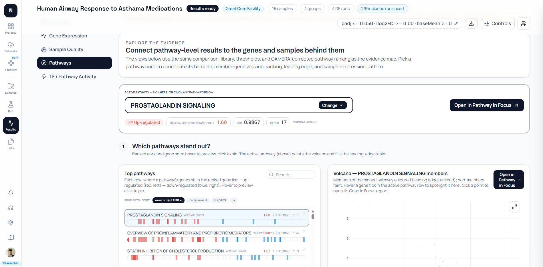
NotchBio links a selected pathway to overlap neighbors, leading-edge genes, member expression, and gene correlations while keeping those evidence layers visibly separate.
In the current backend, build_pathway_neighbors takes one focus set, compares it with sets in the same collection, and ranks neighbors by member-gene Jaccard similarity. It returns node set size plus edge Jaccard and overlap counts.
The neighbor payload also includes pairwise edges among the selected neighbors. This produces a small local network rather than a whole-database hairball. The interface labels the edge weight as Jaccard overlap and lets a reader refocus on a neighbor.
The same Pathway in Focus payload carries leading-edge membership and a member-gene-by-sample heatmap. Rows are clustered using correlation distance for readability, while a separate flag identifies which members belong to the leading edge.
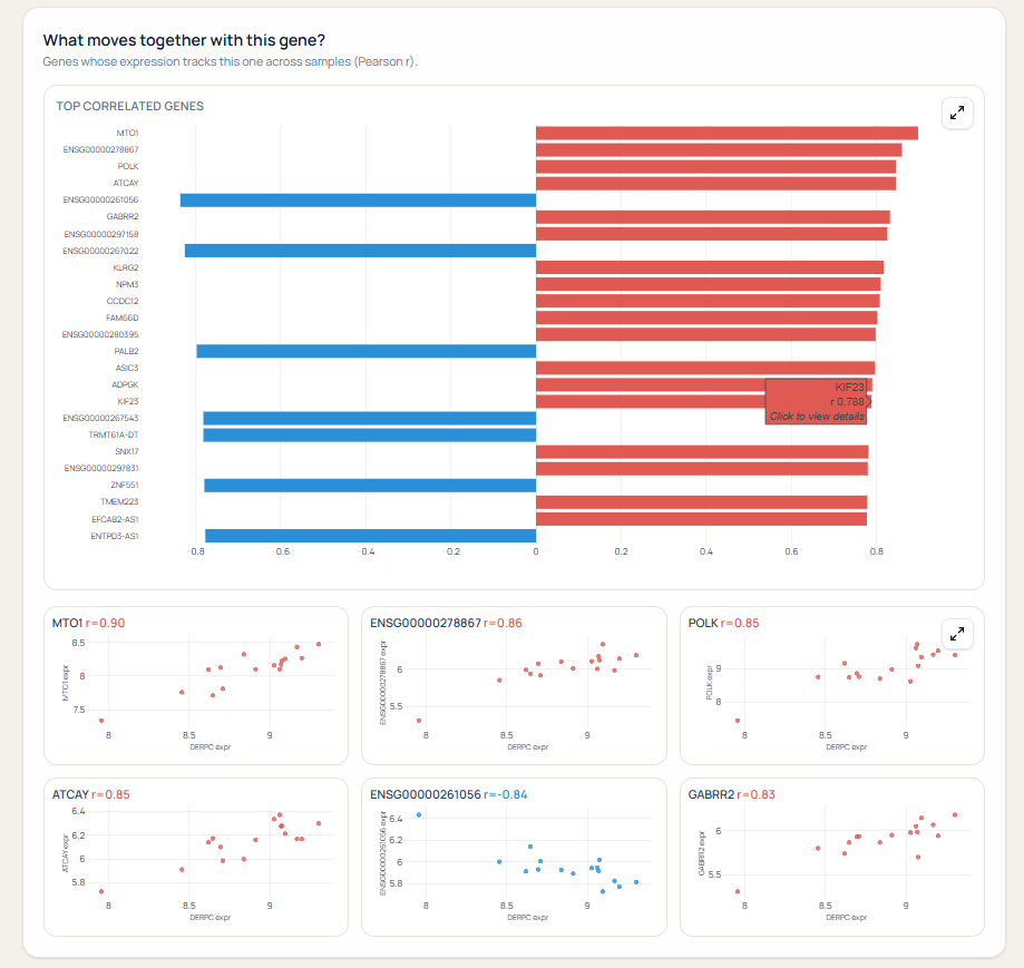
The gene-level report then offers Pearson or Spearman correlation against all genes and shows scatterplots for the strongest pairs. That path supports exploration from a set-level result to a member and its sample-level associations.
NotchBio does not turn those correlations into regulatory edges. It also does not call a Jaccard neighbor an activated pathway. The wording follows the evidence: overlap, leading edge, member expression, correlation, topology, and regulator activity remain separate.
When is a pathway connection misleading?
A pathway connection misleads when the edge is unlabeled, identifiers or releases differ, thresholds hide instability, or association is described as regulation or causality.
Watch for these failure modes:
- Annotation bias: well-studied genes occur in many sets and become artificial hubs.
- Hierarchy bias: broad parent terms connect to many narrow child terms.
- Threshold artifacts: a small cutoff change rewires the visible network.
- Universe mismatch: overlap is calculated before identifier mapping or measured-gene filtering.
- Result leakage: only significant pathways are compared, hiding unstable near-threshold structure.
- Confounding: co-expression reflects condition, batch, cell type, or outliers.
- False direction: an undirected overlap or correlation edge is drawn with an arrow.
- Layout storytelling: spatial proximity is interpreted as biology although it comes from a force algorithm.
One network, one declared meaning
If a figure combines membership, regulation, and co-expression, encode the edge type directly and supply provenance. A single unlabeled line must never carry three biological interpretations.
Treat a pathway network as an index into evidence, not a final mechanistic model. Click through to the shared genes, inspect their statistics and expression, check source annotations, and validate the proposed connection experimentally.
The next step is comparison. How to compare pathways across datasets explains how to preserve direction, missingness, collection versions, and uncertainty across contrasts or studies.
For the prerequisite distinction between gene-set scores and regulator footprints, read Pathway Enrichment vs Pathway Activity. For deeper method code, see GSEA vs ORA with clusterProfiler and reducing redundant GO terms.
Further reading
Read another related post
When to Use edgeR vs DESeq2 vs limma-voom
edgeR vs DESeq2 vs limma-voom for RNA-seq: compare models, normalization, low-count behavior, complex designs, and when to use each method.
Research GuideUnderstanding Your QC Report: FastQC and MultiQC
A module-by-module guide to reading FastQC and MultiQC output for RNA-seq data — what each plot means, which failures matter, and which you can safely ignore.
BioinformaticsHow DESeq2 Actually Works (Without the Math Overload)
The negative binomial model, size factors, dispersion shrinkage, and what each output column really means: DESeq2 explained for working researchers.