How to Build a Biological Pathway Diagram
A pathway diagram is built by defining one biological question, choosing typed entities, connecting them with directed and signed relations, mapping stable identifiers, and recording every source. Add experimental data only as a separate visual layer.
That sequence matters. A polished network can still be biologically wrong if a gene is treated as a protein, a binding edge is drawn as activation, or RNA fold change is presented as measured protein activity.
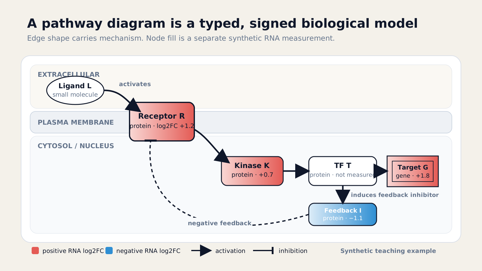
This guide builds a six-node signaling example with one inhibitory feedback edge. It also shows how to represent the graph in Python, export a deterministic SVG, and interpret the corresponding diagram behavior in NotchBio.
What is a pathway diagram?
A pathway diagram is a scoped model of biological entities and their relationships. It can show molecular events, regulatory influences, locations, states, and measurements, but it is never a complete map of the cell.
The word “pathway” covers several representations. A gene set contains members but no wiring. A directed graph adds source-to-target relations. A process diagram can represent reactions, inputs, outputs, catalysts, states, and compartments.
The Systems Biology Graphical Notation separates three useful languages. Process Description shows biochemical events, Activity Flow shows influences between activities, and Entity Relationship shows rules linking entity features.
Choose the language that matches the question. A detailed metabolic reaction needs different symbols from a high-level signaling cascade. Combining conventions without declaring their meanings makes the diagram harder to audit.
A diagram is not an enrichment result
A pathway diagram describes entities and relations. Enrichment tests whether pathway members are unusually represented or ranked in your data. A significant pathway row does not prove that every edge in its diagram operated in your experiment.
What question should the diagram answer?
A diagram should answer one sentence-sized biological question. Define the system, condition, scale, organism, and evidence boundary before deciding which nodes or edges belong on the page.
For the worked example, the question is: “How can ligand L drive target-gene expression while inducing a negative feedback inhibitor?” That scope needs a ligand, receptor, kinase, transcription factor, target gene, and feedback inhibitor.
It does not need every adaptor, phosphatase, paralog, or downstream phenotype. Those may matter in a mechanistic model, but adding unsupported detail would weaken this teaching diagram.
The EMBL-EBI conceptual modelling guide recommends defining the question first, then identifying players, interactions, direction, and sign. Its practical principle is to keep the graph as simple as possible but as complex as necessary.
Write a boundary statement beside the working file. Include the species, cell type, stimulus, compartments, time point, and evidence types. Readers can then see what the diagram intentionally leaves out.
Which nodes belong in a pathway diagram?
Nodes belong when they are required to answer the question and can be assigned an explicit biological type. Store display labels separately from stable identifiers so names can change without breaking the graph.
Common node types include genes, RNAs, proteins, modified proteins, complexes, metabolites, processes, compartments, and phenotypes. A gene symbol alone does not tell a reader which molecular level is meant.
| Node | Useful identifier | What the node means |
|---|---|---|
| Gene | Ensembl gene or NCBI Gene | A genomic locus or gene-level record |
| RNA | Ensembl transcript | A transcript or measured RNA species |
| Protein | UniProt accession | A protein product, ideally with state |
| Complex | Curated complex identifier | A defined set of molecular participants |
| Metabolite | ChEBI identifier | A chemical entity, with compartment if relevant |
| Pathway event | Database event identifier | A reaction, transport, or regulatory process |
State and location can require separate nodes. Cytosolic and nuclear forms of one protein are not interchangeable when translocation is part of the mechanism. An unphosphorylated kinase and its active phosphorylated form may also need distinct states.
The Reactome Pathway Browser guide places molecules in physiologically relevant compartments and represents pathways as connected molecular events. That prevents a visually convenient layout from implying impossible colocalization.
How should activation and inhibition be drawn?
Activation should use a directed arrow and inhibition a blunt-ended line, with both defined in a visible legend. Binding, association, catalysis, transport, and unknown influence need their own declared relation types.
Do not rely on red and green edges alone. Color-vision differences, grayscale exports, and journal styling can erase the distinction. Edge shape should carry the essential meaning; color may reinforce it.
An edge also needs provenance. Record its source entity, target entity, direction, sign, relation subtype, citation, database version, and confidence or evidence class. “A connects to B” is not a sufficient data contract.
Use sign = +1 for supported activating influence, sign = -1 for supported inhibitory influence, and sign = 0 when no usable sign is known. Do not force binding or association into a signed category merely to run a directional model.
Feedback must be drawn as an actual cycle. In Figure 1, the transcription factor induces feedback inhibitor I, and I suppresses the receptor. That inhibitory return edge makes the loop negative.
How do you map genes to proteins and complexes?
Identifier mapping should preserve the source identifier, target identifier, mapping method, version, and unresolved cases. Never silently replace a one-to-many mapping with the first returned record.
RNA-seq results often arrive as Ensembl gene IDs, while a pathway may annotate HGNC symbols, NCBI Gene IDs, UniProt proteins, or ChEBI metabolites. Mapping is therefore a scientific step, not clerical cleanup.
Strip Ensembl version suffixes only when the target resource expects stable gene IDs. Collapse duplicate mappings with a declared rule. Keep unmapped entries visible in a mapping report rather than treating them as zero-valued measurements.
Protein complexes require extra care. A complex node may represent an AND condition in which all subunits are required, not a shortcut for any member. If the experiment measures only transcripts, the complex itself remains unmeasured.
The WikiPathways Academy authoring workflow explicitly asks curators to verify automatically recognized data nodes. Automated extraction can create false positives, so each annotation still needs review.
How do you lay out a pathway graph?
A pathway layout should make direction, compartments, cycles, and repeated states easy to trace. Place biology first, reduce crossings second, and use algorithmic layout only as a reviewed starting point.
For a signaling cascade, a left-to-right or top-to-bottom flow usually works. Keep inputs near the entry boundary, receptors on the membrane, intracellular relays inside the cell, and transcriptional outputs near the nucleus or target-gene region.
Feedback edges need space to loop back without crossing the main cascade. Parallel branches should separate early and rejoin only where the biology actually converges. Crossing two unrelated edges can falsely suggest an interaction.
Use alignment and whitespace to reveal modules, not to imply equal reaction times. Geometric distance is a visual aid unless the figure explicitly defines it as a measured quantity.
SBGN layout guidance requires non-container nodes to avoid overlap and recommends layouts that expose rather than hide the encoded information. It also warns that color should not be the only carrier of meaning.
For small teaching graphs, fixed coordinates are often best because they are stable across exports. For large curated maps, a hierarchical or force-directed layout can reduce manual work, but curators must still check compartments, crossings, labels, and edge endpoints.
| Layout check | Why it matters |
|---|---|
| One dominant reading direction | Readers can follow the causal or process sequence |
| Explicit compartments | Location-dependent mechanisms remain visible |
| Minimal crossings | Unrelated edges are less likely to appear connected |
| Space around feedback loops | Cycles remain traceable from target back to source |
| Stable node positions | Conditions can be compared without layout-induced motion |
| Labels at final article size | The exported figure remains usable, not just the editor view |
How do you overlay expression data?
Overlay expression by joining measured identifiers to compatible nodes, then map one declared statistic to color with a visible scale. Keep missing, filtered, and non-significant values distinct.
For RNA-seq, a diverging scale can show gene-level log2 fold change. Use the same limits across compared diagrams. A symmetric scale such as −2 to +2 prevents one condition from looking stronger only because its legend was rescaled.
Do not label red nodes “active” merely because their transcripts increased. RNA abundance does not directly measure protein abundance, phosphorylation, localization, enzyme flux, or regulator activity.
The overlay also should not rewrite the biological edge. If receptor RNA decreases, an activating receptor-to-kinase edge remains an activating relation in the curated model. The measurement and the relation answer different questions.
Use a neutral fill for not measured, and a separate treatment for measured but statistically uncertain values. A missing node is not equivalent to log2 fold change zero.
How can Python build the graph?
Python can store the biological graph in networkx.DiGraph, keep node and edge attributes explicit, assign fixed coordinates, and export SVG. A fixed teaching layout makes repeated builds deterministic.
The example below stores entity type, stable identifier, synthetic RNA log2 fold change, edge relation, sign, and source. The node positions are presentation data, not biological evidence.
import matplotlib.pyplot as pltimport networkx as nx
graph = nx.DiGraph()graph.add_nodes_from([    ("L", {"kind": "ligand", "id": "SYN:L", "log2fc": None}),    ("R", {"kind": "protein", "id": "SYN:R", "log2fc": 1.2}),    ("K", {"kind": "protein", "id": "SYN:K", "log2fc": 0.7}),    ("T", {"kind": "protein", "id": "SYN:T", "log2fc": None}),    ("G", {"kind": "gene", "id": "SYN:G", "log2fc": 1.8}),    ("I", {"kind": "protein", "id": "SYN:I", "log2fc": -1.1}),])
edges = [    ("L", "R", "activation", 1),    ("R", "K", "activation", 1),    ("K", "T", "activation", 1),    ("T", "G", "expression", 1),    ("T", "I", "expression", 1),    ("I", "R", "inhibition", -1),]for source, target, relation, sign in edges:    graph.add_edge(        source, target, relation=relation, sign=sign,        provenance="synthetic teaching example"    )
positions = {    "L": (0, 2), "R": (1, 2), "K": (2, 1),    "T": (3, 1), "G": (4, 1), "I": (3, 0),}
def node_color(node):    value = graph.nodes[node]["log2fc"]    if value is None:        return "#ffffff"    return "#e45b55" if value > 0 else "#2f8fd3"
fig, ax = plt.subplots(figsize=(12, 5), layout="constrained")nx.draw_networkx_nodes(    graph, positions, node_color=[node_color(n) for n in graph],    edgecolors="#0f172a", linewidths=1.8, node_size=2400, ax=ax)nx.draw_networkx_labels(graph, positions, font_weight="bold", ax=ax)
positive = [(u, v) for u, v, d in graph.edges(data=True) if d["sign"] > 0]negative = [(u, v) for u, v, d in graph.edges(data=True) if d["sign"] < 0]nx.draw_networkx_edges(    graph, positions, edgelist=positive, arrowstyle="-|>",    arrows=True, arrowsize=24, width=2.2, edge_color="#0f172a",    node_size=2400, min_source_margin=4, min_target_margin=8, ax=ax)nx.draw_networkx_edges(    graph, positions, edgelist=negative, arrowstyle="-[",    arrows=True, arrowsize=24, width=2.2, edge_color="#0f172a",    node_size=2400, min_source_margin=4, min_target_margin=8,    connectionstyle="arc3,rad=-0.35", ax=ax)ax.axis("off")fig.savefig("signed-pathway.svg", format="svg", metadata={"Creator": "NetworkX"})
The current NetworkX drawing documentation supports explicit positions, labels, directed arrow styles, and separate edge lists. Those controls are enough for a small reproducible schematic.
For a publication figure, inspect the SVG manually. Check crossings, label collisions, arrow endpoints, font size, color contrast, and whether the negative edge still reads correctly in grayscale.
Keep the graph data beside the rendering code. A compact node table and edge table allow readers to inspect the model without reverse-engineering SVG paths.
nodes: node_id, label, entity_type, database_id, compartment, stateedges: source, target, relation, sign, evidence, citation, database_versionvalues: node_id, comparison, statistic, value, uncertainty, measured_statelayout: node_id, x, y, width, heightThis separation prevents a common software mistake: storing biological meaning only in drawing properties. An arrow marker is presentation; relation="activation" and sign=+1 are machine-readable model attributes.
How does NotchBio resolve pathway diagrams?
NotchBio maps human pathway names to WikiPathways IDs, sanitizes fetched CC0 SVGs, and overlays gene evidence. Native, related, unavailable, and non-human states remain separate.
The backend first checks a committed pathway-name map and attempts to cache fetched SVGs on disk. A native WikiPathways set can resolve directly. For a non-WikiPathways set, the code may choose a related map only when gene overlap passes its coverage and similarity gates.
That related state remains explicit in the response. It is not presented as an exact pathway-identity match. If no diagram passes the gate, the product returns “no diagram” rather than showing a misleading near-match.
The frontend fits the sanitized SVG to a pan-and-zoom canvas and identifies candidate gene nodes through HGNC or Ensembl class tokens. Current statistic lookup uses HGNC symbols, so an Ensembl-only node can remain neutral rather than receiving a guessed value.
When an HGNC symbol matches the result data, the view can recolor that node by gene log2 fold change or by propagated topology accumulation. Unmatched nodes remain explicitly neutral.
Those modes are distinct. Fold-change color shows an observed gene-level RNA statistic. Impact color shows a model-derived propagated accumulation when a signed topology result is available.
NotchBio also keeps the graph-scoring layer reproducible. Signed directed graph snapshots are pinned with database, version, organism, node, edge, and fingerprint provenance. Relation subtypes map to positive, negative, or unsigned values.
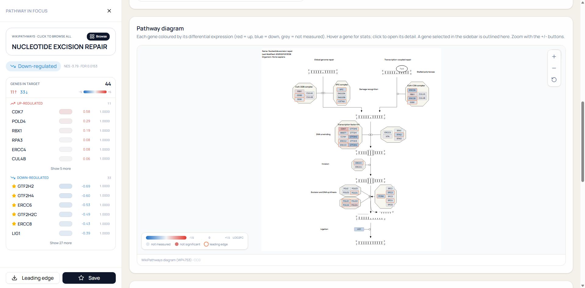
The product view preserves the source attribution and overlay legend beside the rendered molecular map. Neutral nodes remain visible, and the sidebar keeps the member-level values that support the color overlay.
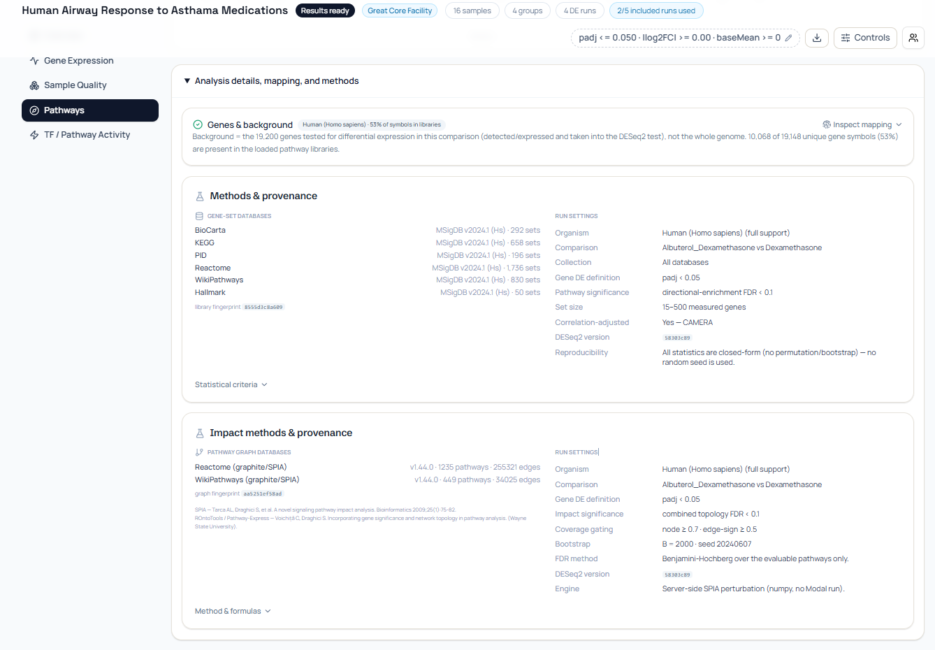
Figure 4 documents the current method and graph provenance; it complements the molecular diagram rather than replacing it. Each product capture proves only the interface state it actually shows.
What makes a pathway diagram misleading?
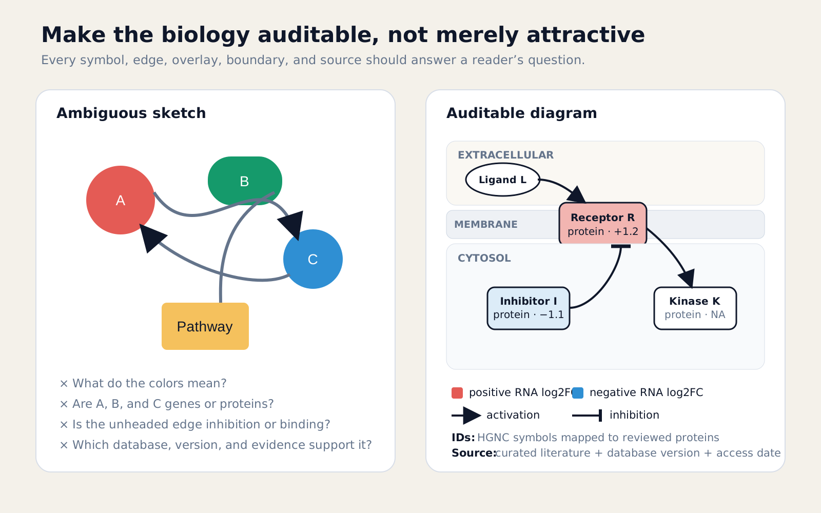
A pathway diagram misleads when visual certainty exceeds the evidence. Common failures include mixed entity levels, undocumented edges, hidden missing data, ambiguous arrows, and omitted provenance.
Avoid these specific claims:
- A red transcript node proves the encoded protein is active.
- A binding edge proves activation or inhibition.
- A pathway boundary contains every relevant cellular interaction.
- A significant enrichment result validates the displayed mechanism.
- A related pathway map is identical to the tested gene set.
- An automatic layout or polished SVG validates biological curation.
Check the diagram as both a graph and a scientific argument. Every node should have a type and identifier. Every edge should have direction, relation, sign state, and source. Every overlay should name its statistic, scale, missingness rule, and comparison.
Finally, preserve the editable graph data beside the exported figure. SVG is useful for publication, but a table of nodes and edges is what lets another researcher audit, update, or rebuild the model.
If you still need the scored pathway input, begin with How to Do Pathway Analysis with RNA-Seq.
The next guide, How to Interpret Pathway Analysis Results, moves from the diagram to the evidence around it: score, direction, FDR, coverage, driver genes, and agreement between enrichment and topology.
For the statistical step before diagramming, read Pathway Enrichment Analysis: GSEA and ORA in R and Python. For gene-set direction and leading edges, see What Is GSEA?.
Further reading
Read another related post
Deterministic vs AI-Generated RNA-Seq Pipeline Code
Compare deterministic and AI-generated RNA-seq pipeline code: reproducibility, validation, failure modes, and where AI assistance is safe to use.
Tutorialfastp vs Trimmomatic vs BBDuk: A Benchmark on RNA-Seq Reads
A side-by-side benchmark of fastp, Trimmomatic, and BBDuk on paired-end RNA-seq data: speed, post-trim quality, mapping rate, and downstream DEG impact.
TutorialDESeq2 Tutorial in R: Count Matrix to Volcano Plot
A complete DESeq2 tutorial in R: loading counts, building the design formula, running DE, applying lfcShrink, generating a volcano plot, and exporting results.