How DESeq2 Actually Works (Without the Math Overload)
DESeq2 has been cited over 86,000 times as of early 2026. It is the most widely used tool in bulk RNA-seq analysis, and most people who use it could not explain in plain language what it actually does between the moment you call DESeq(dds) and the moment a results table appears. That is not a criticism. The tool is designed to work well without requiring the user to understand every statistical step. But understanding what is happening inside the box changes how you interpret the output, diagnose unexpected results, and make smarter decisions about your analysis.
This post explains how DESeq2 works, without the Greek letters. It covers the negative binomial model and why it exists, the three-step pipeline DESeq2 runs before reporting any p-values, how dispersion shrinkage and fold change shrinkage work and why both matter, and what every column in the results table actually means. If you need the upstream context for where these counts come from, start with What Is a Count Matrix and Why Does It Matter. If you are comparing DESeq2 to alternatives rather than learning it in isolation, When to Use edgeR vs DESeq2 vs limma-voom picks up from there.
Why Not Just Use a t-Test?
Before understanding DESeq2, it is worth understanding why the obvious approaches fail on RNA-seq data.
A t-test compares the means of two groups and uses within-group variance to calculate a test statistic. It works well when you have reasonably normally distributed data and enough samples per group. RNA-seq counts are neither normally distributed nor present in large numbers. They are non-negative integers that span several orders of magnitude, and in most experiments you have three to six samples per condition, not thirty.
The deeper problem is overdispersion. In a simple Poisson model, the variance of counts equals the mean. RNA-seq data consistently violates this: the variance is much larger than the mean, especially for lowly expressed genes. A gene with a mean count of 50 might have a standard deviation of 80 across biological replicates. If you use a model that assumes variance equals mean, your test statistics will be inflated and your p-values will be too small.
The negative binomial distribution has two parameters: a mean and a dispersion parameter. The dispersion parameter controls how much the variance exceeds the mean. By fitting a negative binomial model to each gene, DESeq2 captures the real overdispersion in your data and produces appropriately calibrated p-values. A t-test is underpowered for counts, and DESeq2 additionally benefits from examining thousands of genes to have a better estimate of dispersion than a method that looks at one gene at a time (Bioconductor support thread).
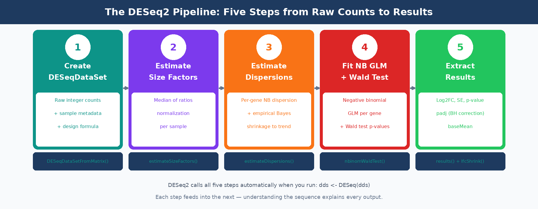
The Three-Step Pipeline
When you call DESeq(dds), three sequential estimation steps run before any statistical testing.
Step 1: Estimate Size Factors
As covered in the count matrix post, DESeq2 uses the median of ratios method to calculate a size factor for each sample. The size factor captures the combined effect of sequencing depth and RNA composition on that sample’s library. It is a single number per sample, typically close to 1.0 for well-behaved experiments.
dds <- estimateSizeFactors(dds)sizeFactors(dds)# Ctrl1 Ctrl2 Ctrl3 Treat1 Treat2 Treat3# 0.89 1.02 0.94 1.08 1.15 0.96These size factors are used in every subsequent step. Every time DESeq2 computes an expected count for a gene in a sample, it multiplies by that sample’s size factor to put everyone on a comparable scale.
Step 2: Estimate Dispersions
Dispersion is the parameter that controls overdispersion in the negative binomial model. Every gene gets its own dispersion estimate, because different genes have different biological variability. A tightly regulated housekeeping gene will have low dispersion. A gene whose expression varies strongly between individual mice of the same genotype will have high dispersion.
The problem is that with three replicates per condition, per-gene dispersion estimates are extremely noisy. A gene that happens to have one outlier replicate will get an inflated dispersion estimate, which makes it harder to detect as differentially expressed even if it genuinely changes between conditions.
DESeq2’s solution is empirical Bayes shrinkage. It fits a smooth trend line through the per-gene dispersion estimates as a function of mean expression (highly expressed genes tend to have lower dispersion). Then it shrinks each gene’s individual dispersion estimate toward this trend. Genes with enough replicates to produce reliable estimates stay close to their individual estimate. Genes with noisy estimates get pulled toward the trend.
The result is a dispersion estimate per gene that is more reliable than the individual estimate but still incorporates that gene’s own data. This is the key insight that makes DESeq2 work well with three replicates: it borrows statistical strength across thousands of genes to calibrate each individual gene’s variance estimate.
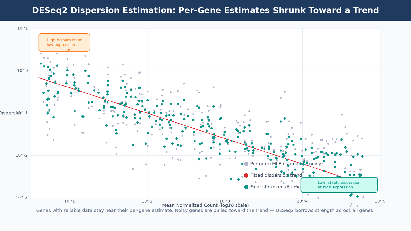
The dispersion plot is a diagnostic tool
When you run DESeq2, the dispersion plot is worth examining before proceeding to results. Most genes should cluster reasonably around the trend line. If you see massive scatter or the trend line is flat or unusual, it may indicate a quality problem with your data, a very small sample size, or a study design that violates DESeq2’s assumptions.
Step 3: Fit the GLM and Test
With size factors and dispersions in hand, DESeq2 fits a generalized linear model with negative binomial errors to each gene. The model predicts the expected count for each sample based on that sample’s size factor, the gene’s base expression level, and the log2 fold change associated with each term in your design formula.
The Wald test is then applied to each coefficient in the model. For a simple two-group comparison, the coefficient of interest is the log2 fold change between treated and control. The Wald statistic is this fold change divided by its standard error. That statistic is compared to a standard normal distribution to produce a two-tailed p-value.
The alternative is the likelihood ratio test (LRT), which compares the full model to a reduced model without the term of interest. LRT is more appropriate when testing multi-level factors (more than two conditions) or interaction terms where the Wald test is not straightforwardly interpretable.
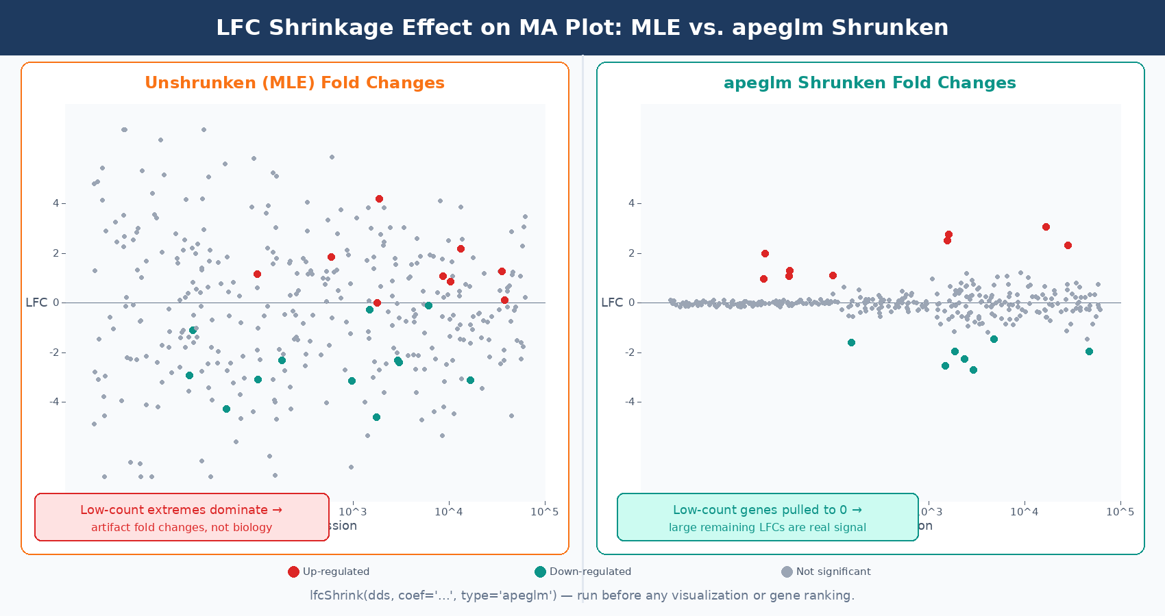
Fold Change Shrinkage: The Step Most People Skip
After fitting the model, the raw log2 fold change estimates are called MLE estimates (maximum likelihood estimates). These are calculated per-gene from the data alone, without any pooling. For highly expressed genes with tight replicates, MLE fold changes are reliable. For lowly expressed genes or genes with high dispersion, the MLE fold change can be wildly inflated simply due to sampling noise.
A gene with a mean count of 5 might show an apparent fold change of 8 across three replicates when the true fold change is 1.5. The data is too sparse to constrain the estimate. If you rank genes by fold change for downstream analysis, these noisy low-count genes will dominate the top of your list for the wrong reasons.
DESeq2 addresses this with a second round of shrinkage applied specifically to log2 fold changes. The current default method, apeglm, fits an adaptive prior distribution to all fold change estimates and shrinks genes with low information toward zero. The amount of shrinkage is proportional to the uncertainty in each gene’s fold change: genes with low counts or high dispersion get shrunk toward zero more aggressively, genes with tight replicates and high expression stay close to their MLE estimate.
# After running DESeq(dds), apply fold change shrinkageres_shrunk <- lfcShrink( dds, coef = "condition_treated_vs_control", # must match resultsNames(dds) type = "apeglm" # default since DESeq2 v1.28; apeglm is the recommended estimator)The critical thing to know: LFC shrinkage does not change which genes are called significantly differentially expressed. The padj values and the list of significant genes are determined by the Wald test before shrinkage. What shrinkage changes are the fold change estimates used for ranking, visualization, and downstream functional analysis. If you are feeding fold changes into GSEA, plotting a volcano, or ranking genes by effect size, you should use the shrunken estimates (Harvard HBC Training).
Always use shrunken LFCs for GSEA, volcano plots, and fold change cutoffs
Unshrunken MLE fold changes are noisy and will overrepresent lowly expressed genes at the extremes of your volcano plot. The apeglm shrunken estimates give a much more interpretable picture of where the real large-effect genes are. Use lfcShrink() before any visualization or ranking step.
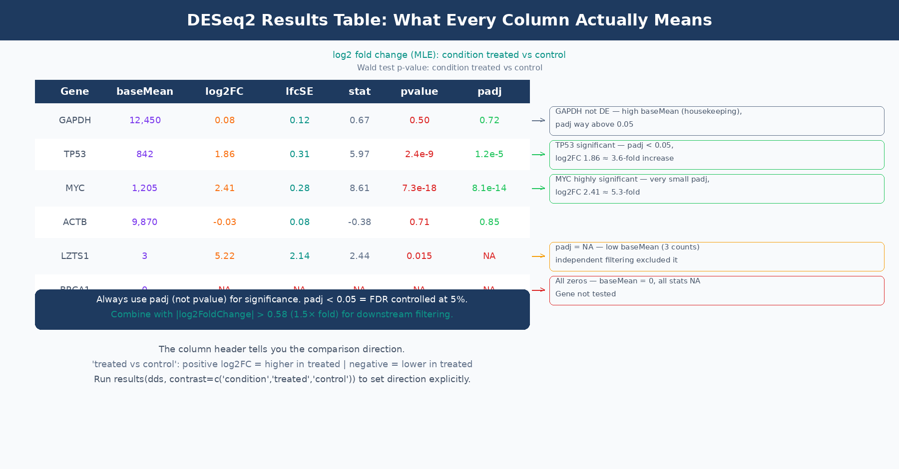
Reading the Results Table
When you call results(dds), you get a table with six columns. Every column has a specific meaning, and several of them are commonly misread.
| Column | What It Actually Is | Common Misreading |
|---|---|---|
baseMean | Mean of normalized counts across ALL samples (both conditions) | Confused with condition-specific mean |
log2FoldChange | Log2 ratio of treated to control (MLE, before shrinkage) | Assumed to equal log2(normalized count ratio) |
lfcSE | Standard error of the log2FoldChange estimate | Ignored, but encodes how trustworthy the LFC is |
stat | Wald statistic: log2FoldChange ÷ lfcSE | Rarely used directly |
pvalue | Raw two-tailed Wald test p-value | Used directly for significance calling |
padj | Benjamini-Hochberg adjusted p-value (FDR) | Confused with pvalue; or NA values not understood |
baseMean is the mean of normalized counts across every sample in the dataset, not just the samples in the comparison of interest. This is confirmed by the DESeq2 author Michael Love directly: “It’s the mean of all samples in the dataset. We use the mean of all normalized counts.” (Bioconductor support). A gene with baseMean of 50 might have a mean count of 15 in controls and 85 in treatment; baseMean does not tell you either of those numbers separately.
log2FoldChange before shrinkage is the MLE estimate, which equals the coefficient from the GLM model. It is not simply log2(mean_treated / mean_control) computed from normalized counts, because the GLM model accounts for size factors and dispersion estimation in a way that can produce slightly different values. The header line of the results table tells you the direction: “log2 fold change (MLE): condition treated vs control” means positive values indicate higher expression in treated samples.
padj is the adjusted p-value after Benjamini-Hochberg (BH) multiple testing correction. This is the value you use for significance calling, not pvalue. The BH procedure controls the false discovery rate: at padj < 0.05, you expect 5% of your significant calls to be false positives. Use padj < 0.05 as your primary significance threshold, and optionally combine it with abs(log2FoldChange) > 0.58 (which corresponds to a 1.5-fold change) for downstream analysis.
When padj is NA: This happens in two situations. First, genes with zero total counts across all samples receive NA for all statistics. Second, DESeq2 performs independent filtering: genes with very low mean counts are excluded from multiple testing correction because they cannot be significant regardless of the nominal p-value. This is a power-optimizing step that removes hopeless tests from the multiple comparison burden. Genes filtered this way get padj = NA, not padj = 1. They are not significant, but they are not penalizing your ability to call other genes significant either. The documentation in the results() function notes this clearly: the filter used is the mean of normalized counts, and the threshold is chosen to maximize the number of adjusted p-values below the significance threshold (DESeq2 documentation).
A Note on the MA Plot and What It Shows
The MA plot is DESeq2’s primary diagnostic visualization for results. It plots the mean expression (x-axis, log scale) against the fold change (y-axis) for every gene. Significant genes are highlighted.
Three things to look for in a well-behaved MA plot. First, most genes should scatter around fold change zero, reflecting the assumption that most genes are not differentially expressed. If the cloud tilts systematically above or below zero, something is wrong with your normalization or there is a global expression shift in your data. Second, the significant genes should be distributed across the full range of expression levels, not clustered at one extreme. Third, the width of the fold change scatter should decrease as mean expression increases: lowly expressed genes have noisier fold changes.
If you apply LFC shrinkage before plotting, the MA plot changes in a characteristic way: the fold changes of lowly expressed genes get pulled toward zero, creating a tighter cloud at low counts. This makes it much easier to see where the genuinely large-effect genes sit. Plotting the shrunken MA plot is strongly recommended over the default unshrunken version.
# Generate MA plot with shrunken LFCs — much cleaner than defaultplotMA(res_shrunk, ylim = c(-5, 5), main = "MA plot: treated vs control (apeglm shrinkage)")Common Misuses and How to Avoid Them
Running DESeq2 on pre-normalized values. Covered in the count matrix post, but worth repeating: DESeq2 expects raw integer counts. If you have TPM or FPKM values in your matrix, the model’s assumptions are violated and the results are statistically invalid.
Calling significant genes based on pvalue rather than padj. Testing differential expression across 20,000 genes means that even perfectly random data will produce hundreds of “significant” genes at p < 0.05 by chance. The padj column applies Benjamini-Hochberg correction to control this. Always use padj.
Ignoring the NA padj values. Genes with padj = NA are not missing results due to a computational error. They are either zero-count genes excluded from testing or low-count genes excluded from multiple testing correction by independent filtering. Do not substitute NA with 1, and do not remove them from your table before understanding why they are there.
Using unshrunken fold changes for ranking or GSEA input. The MLE fold changes in the default results table are the right values for hypothesis testing (the Wald test uses them internally) but not the right values for ranking or visualization. Run lfcShrink() and use those estimates for everything downstream of significance calling.
Running all conditions together when some have massive between-group variance. If your experiment has three very different cell types and you are only interested in the comparison between conditions within one cell type, including the other cell types in the same DESeq2 object can inflate the dispersion estimates for all genes, reducing power for the comparison you actually care about. The DESeq2 FAQ addresses this case and suggests that splitting into pairwise analyses is sometimes the better approach.
Putting It Together
DESeq2 is doing something principled at every step. It uses the negative binomial model because RNA-seq counts are overdispersed. It estimates size factors because library sizes differ. It shrinks dispersion estimates because per-gene estimates are noisy with few replicates. It applies the Wald test because the fold change estimate has a computable standard error. It shrinks fold changes because MLE estimates are unreliable for low-count genes. It adjusts p-values because you are testing 20,000 hypotheses simultaneously.
Every one of these steps has a specific consequence for your output. When results look strange, the first place to look is which assumption has been violated: the design matrix, the count matrix format, the direction of the contrast, the treatment of outliers, or the independence of samples.
NotchBio runs the full DESeq2 workflow from raw counts to results, applying size factor estimation, dispersion shrinkage, Wald testing, and apeglm fold change shrinkage automatically. The results table, MA plot, and dispersion diagnostic plot are provided for every run. If you want DESeq2 results without configuring each step by hand, start at notchbio.app.
Further reading
Read another related post
The One-Bioinformatician Problem: Stop Being The Bottleneck
If you are the only bioinformatician serving multiple PIs, you are the bottleneck. Here is how to scale with templates, self-service, and clear handoffs.
TutorialORA vs GSEA: A Side-by-Side Tutorial in R with clusterProfiler
ORA and GSEA answer different questions. A working clusterProfiler tutorial with FDR correction, proper backgrounds, and side-by-side result interpretation.
Research GuideWhy Your DESeq2 Log2 Fold Change Cutoff Of Zero Is Wrong
Filtering DEGs at log2FC greater than zero returns half your genome. How to choose a defensible cutoff, apply lfcShrink, and avoid the GO-term explosion.