How to Make Volcano Plots and MA Plots in R: ggplot2 and EnhancedVolcano
The two most common plots after a bulk RNA-seq differential expression analysis are the volcano plot and the MA plot. Most researchers treat them as interchangeable summaries of the same data. They are not. Each one shows you something the other cannot, and reading them together tells a story that neither tells alone.
This tutorial walks through building both plots in R from DESeq2 results, starting from a raw ggplot2 call and building up to publication-quality figures with labeled top genes. It also covers EnhancedVolcano for when you want a quick annotated plot without writing the geometry layer by layer.
If you still need the results table feeding these plots, How to Run DESeq2: A Complete Walkthrough from Count Matrix to Results gets you there, and What Is GSEA and Why Does It Beat a Simple DEG List explains why you should keep the full ranked list after plotting.
What Is a Volcano Plot in RNA-Seq?
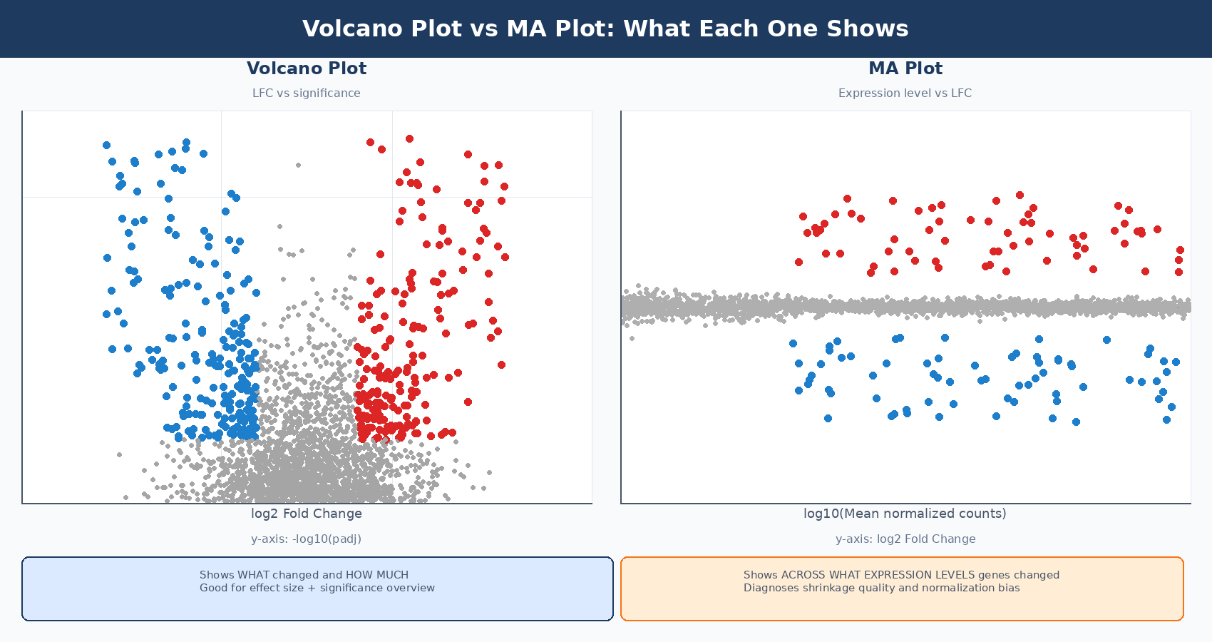
A volcano plot is a scatter plot with two axes derived from DESeq2 results: log2 fold change on the x-axis and statistical significance, expressed as -log10(padj), on the y-axis. The shape it produces - a broad base with two upward arms of significant genes - is what gives it the name.
Genes that are both statistically significant and large in effect size appear at the top corners: high on the y-axis because they have small adjusted p-values, and far left or right on the x-axis because they have large fold changes. Genes that are statistically significant but modestly changing appear near the center top. Genes with large fold changes but poor statistical support appear in the wings with low y-values.
The volcano plot is good at a specific question: how many genes changed, and in which direction? It conveys the global picture of an experiment in a single image. It does not tell you whether your normalization worked, whether your significant genes are spread evenly across expression levels, or whether low-count noise is dominating your results. That is what the MA plot is for.
Always use the shrunk log2FoldChange column for both plots
The results() function returns MLE fold change estimates that are extremely noisy for lowly expressed genes. If you plot these directly, your volcano wings will be dominated by genes with 2 or 3 counts where the fold change estimate is effectively meaningless. Always run lfcShrink() with apeglm before plotting, and use the shrunk log2FoldChange column for both your volcano and MA plots.
How to Prepare DESeq2 Results for Plotting
Before any plot code, the setup is the same: a data frame with gene symbols, shrunk fold changes, and significance labels.
library(DESeq2)library(dplyr)library(ggplot2)library(ggrepel)
# Assume you have a fitted dds and ran lfcShrink()# If not, run:#   dds <- DESeq(dds)#   res_shrunk <- lfcShrink(dds, coef = "condition_treated_vs_control",#                           type = "apeglm")
# Convert to data frame and add gene symbolsres_df <- as.data.frame(res_shrunk)res_df$gene_id <- rownames(res_df)
# Add gene symbols (from previous import step)library(AnnotationDbi)library(org.Hs.eg.db)gene_ids_clean      <- gsub("\\..*", "", res_df$gene_id)res_df$symbol       <- mapIds(org.Hs.eg.db,                               keys     = gene_ids_clean,                               column   = "SYMBOL",                               keytype  = "ENSEMBL",                               multiVals = "first")
# Create a significance category column# Three categories: up, down, not significant (ns)res_df <- res_df %>%    mutate(        significance = case_when(            padj < 0.05 & log2FoldChange >  1 ~ "Up",            padj < 0.05 & log2FoldChange < -1 ~ "Down",            TRUE                               ~ "NS"        ),        # Replace NA padj (filtered genes) with NS        significance = ifelse(is.na(padj), "NS", significance)    )
table(res_df$significance)#  Down    NS    Up#   388 17058   412
How to Make a Volcano Plot in R with ggplot2
Start with the minimal version, then add layers. This approach makes it easy to understand what each layer contributes.
Step 1: Base scatter plot
# Compute -log10(padj), capping very small values to avoid infinite axisres_df <- res_df %>%    mutate(        neg_log10_padj = -log10(pmax(padj, 1e-300)),        neg_log10_padj = ifelse(is.na(neg_log10_padj), 0, neg_log10_padj)    )
# Colors for the three categoriessig_colors <- c("Up" = "#e63946", "Down" = "#1d7ecc", "NS" = "grey75")
# Base plotp_volcano <- ggplot(res_df,    aes(x = log2FoldChange, y = neg_log10_padj, color = significance)) +    geom_point(size = 0.8, alpha = 0.7) +    scale_color_manual(values = sig_colors) +    geom_hline(yintercept = -log10(0.05), linetype = "dashed",               color = "grey40", linewidth = 0.4) +    geom_vline(xintercept = c(-1, 1), linetype = "dashed",               color = "grey40", linewidth = 0.4) +    labs(        x     = bquote(log[2]~"Fold Change"),        y     = bquote(-log[10]~"(adjusted p-value)"),        title = "treated vs control",        color = NULL    ) +    theme_bw(base_size = 12) +    theme(        panel.grid.minor = element_blank(),        legend.position  = "top",        plot.title       = element_text(hjust = 0.5, face = "bold")    )
p_volcano
How to Label Top Genes on a Volcano Plot with ggrepel
Labeling all significant genes makes the plot unreadable. The standard approach is to label the top N genes by significance, by fold change magnitude, or by a custom gene list. ggrepel::geom_label_repel() positions labels without overlap.
# Select top 20 genes to label: most significant among those with |LFC| > 1top_genes <- res_df %>%    filter(significance != "NS") %>%    arrange(padj) %>%    slice_head(n = 20) %>%    pull(symbol)
# Add label column: gene symbol for top genes, empty for everything elseres_df <- res_df %>%    mutate(label = ifelse(symbol %in% top_genes & !is.na(symbol),                          symbol, ""))
# Add labels to the existing plotp_volcano_labeled <- p_volcano +    geom_label_repel(        data    = filter(res_df, label != ""),        aes(label = label),        size         = 2.8,        fontface     = "italic",        box.padding  = 0.4,        max.overlaps = 30,        segment.size = 0.3,        segment.color = "grey50",        fill         = "white",        color        = "black",        label.size   = 0.2,        show.legend  = FALSE    )
p_volcano_labeled
Adding DEG counts to the plot
A common refinement is to annotate the plot with the number of up- and downregulated genes in the respective corners:
n_up   <- sum(res_df$significance == "Up",   na.rm = TRUE)n_down <- sum(res_df$significance == "Down",  na.rm = TRUE)
# Get axis limits to position annotationsx_max  <- max(abs(res_df$log2FoldChange), na.rm = TRUE) * 0.85y_max  <- max(res_df$neg_log10_padj,       na.rm = TRUE) * 0.95
p_volcano_labeled +    annotate("text", x =  x_max, y = y_max,             label = paste0("Up: ", n_up),             color = "#e63946", size = 4, fontface = "bold", hjust = 1) +    annotate("text", x = -x_max, y = y_max,             label = paste0("Down: ", n_down),             color = "#1d7ecc", size = 4, fontface = "bold", hjust = 0)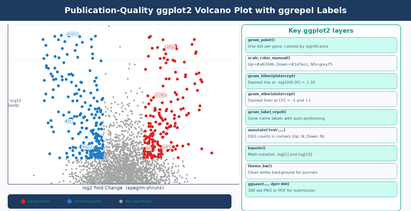
How to Make a Publication-Ready Volcano Plot with EnhancedVolcano
EnhancedVolcano is a Bioconductor package that wraps the ggplot2 logic above into a single function call, with sensible defaults for publication figures. It is the right tool when you need a good-looking annotated plot quickly, or when you are prototyping before writing custom ggplot2 code (EnhancedVolcano vignette, Bioconductor).
BiocManager::install("EnhancedVolcano")library(EnhancedVolcano)
# EnhancedVolcano expects a data frame where gene names are row namesres_ev <- res_dfrownames(res_ev) <- res_ev$symbol
EnhancedVolcano(    res_ev,    lab         = rownames(res_ev),    x           = "log2FoldChange",    y           = "padj",           # use padj, not pvalue    pCutoff     = 0.05,    FCcutoff    = 1.0,    title       = "treated vs control",    subtitle    = "DESeq2 + apeglm shrinkage",    pointSize   = 1.5,    labSize     = 3.5,    col         = c("grey70", "grey40", "#1d7ecc", "#e63946"),    drawConnectors = TRUE,    widthConnectors = 0.3,    legendPosition  = "top")
EnhancedVolcano labels too many genes by default
The default EnhancedVolcano call labels every significant gene, which is usually unreadable. Use selectLab to specify a vector of gene symbols you want labeled, or set max.overlaps to limit the number of labels drawn. For most experiments with hundreds of significant genes, labeling the top 15 to 25 by padj is a sensible default.
What Is an MA Plot and What Does It Diagnose?
The MA plot (also called a mean-difference plot or MD plot) puts log2 fold change on the y-axis and mean expression level on the x-axis, usually on a log10 scale. Every gene is a dot. The y = 0 horizontal line represents no change.
The name comes from the transformation: M is log2(treated/control) and A is the average log expression across both conditions. They represent the two components of any pairwise comparison: the difference and the average.
What the MA plot tells you that the volcano plot cannot:
Distribution of significant genes across expression levels. In a well-behaved experiment, significant genes should appear across the full range of expression levels, not only at high baseMean values. If significant genes cluster only at high baseMean, your test has low power for lowly expressed genes, which may indicate insufficient replication or sequencing depth.
Whether lfcShrink was applied correctly. Before shrinkage, the MA plot shows a distinctive horn shape: genes at low baseMean have enormous apparent fold changes in both directions, creating wide wings near the y-axis. After lfcShrink with apeglm, those wings collapse and the plot looks like a symmetric cloud centered at y = 0. The DESeq2 vignette describes it this way: it is more useful to visualize the MA plot for the shrunken log2 fold changes, which remove the noise associated with log2 fold changes from low count genes without requiring arbitrary filtering thresholds (DESeq2 vignette).
Directional bias. If the MA plot’s non-significant cloud drifts away from y = 0, especially at high expression levels, something is wrong with normalization.
How to Make an MA Plot in R from DESeq2 Results
Built-in DESeq2 plotMA
The quickest option:
# DESeq2's built-in MA plot# Use the shrunk results object, not the raw results() outputplotMA(res_shrunk, ylim = c(-4, 4), alpha = 0.05, main = "MA Plot: treated vs control (apeglm)")abline(h = 0, col = "red", lwd = 2)Points are colored blue if padj < 0.1 (the default alpha). Open triangles indicate points that fall outside the y-axis window.
Custom ggplot2 MA plot for publication
# Build a ggplot2 MA plot from the shrunk resultsma_df <- res_df %>%    filter(!is.na(baseMean) & baseMean > 0) %>%    mutate(        # Clamp extreme LFCs to fit in plot window        lfc_clamped = pmin(pmax(log2FoldChange, -5), 5),        # Flag whether the LFC was clamped for triangle shape        out_of_range = log2FoldChange < -5 | log2FoldChange > 5,        out_of_range = ifelse(is.na(out_of_range), FALSE, out_of_range)    )
p_ma <- ggplot(ma_df,    aes(x = log10(baseMean), y = lfc_clamped, color = significance)) +    geom_point(        data = filter(ma_df, !out_of_range),        size = 0.7, alpha = 0.6    ) +    geom_point(        data  = filter(ma_df, out_of_range),        shape = 17, size = 1.5, alpha = 0.8   # triangles for clamped points    ) +    scale_color_manual(values = sig_colors) +    geom_hline(yintercept = 0, color = "grey30", linewidth = 0.5) +    geom_hline(yintercept = c(-1, 1), linetype = "dotted",               color = "grey60", linewidth = 0.3) +    scale_x_continuous(        breaks = 0:5,        labels = c("1", "10", "100", "1k", "10k", "100k")    ) +    labs(        x     = "Mean of normalized counts (log10)",        y     = bquote(log[2]~"Fold Change"),        title = "MA Plot: treated vs control",        color = NULL    ) +    theme_bw(base_size = 12) +    theme(        panel.grid.minor = element_blank(),        legend.position  = "top",        plot.title       = element_text(hjust = 0.5, face = "bold")    ) +    coord_cartesian(ylim = c(-5, 5))
p_ma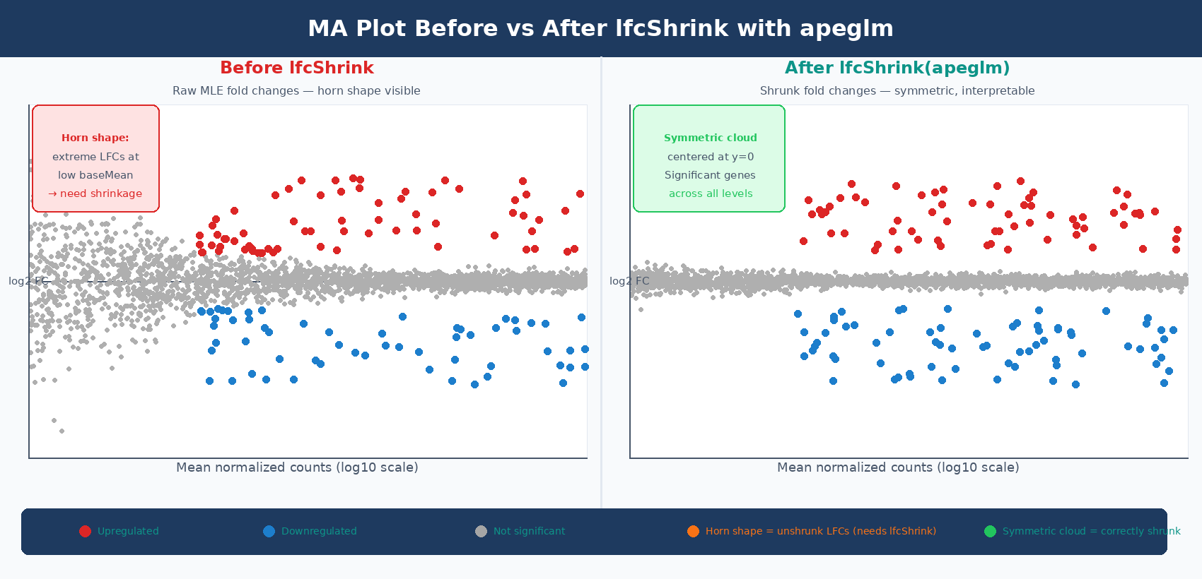
What the MA Plot Shape Tells You About Your Data
| MA Plot Pattern | What It Means | What to Do |
|---|---|---|
| Horn shape at low baseMean | Unshrunk MLE fold changes being plotted | Run lfcShrink() with apeglm and re-plot |
| Significant genes only at high baseMean | Low statistical power for lowly expressed genes | Increase replication or sequencing depth |
| Cloud drifts above y=0 at all expression levels | Normalization artifact or genuine global upregulation | Check size factors; consider comparing to spike-in controls |
| Very few significant genes anywhere | Treatment effect is small, or replication is insufficient | Report as is; do not over-threshold |
| Significant genes appear even at baseMean < 5 | Pre-filtering was too loose | Tighten filtering threshold and re-run |
The most common pattern that indicates a problem is the horn. If you see enormous fold changes in both directions for genes with baseMean < 10, you are plotting unshrunk MLE values. Apply lfcShrink() before plotting. This is not optional for MA plots - the whole purpose of the MA plot is to assess shrinkage and normalization quality, and it cannot do that job if the values are not shrunk.
How to Save Publication-Quality Plots to PDF and PNG in R
For journals, plots should be saved as vector formats (PDF or SVG) at print resolution. ggplot2::ggsave() handles both:
# Save volcano plot as PDF (vector, lossless, any size)ggsave(    filename = "results/figures/volcano_treated_vs_control.pdf",    plot     = p_volcano_labeled,    width    = 6,   # inches    height   = 5,    device   = "pdf")
# Save as high-resolution PNG (for presentations, GitHub, lab reports)ggsave(    filename = "results/figures/volcano_treated_vs_control.png",    plot     = p_volcano_labeled,    width    = 6,    height   = 5,    dpi      = 300,   # 300 dpi is the minimum for most journals    device   = "png")
# Save MA plotggsave("results/figures/ma_plot_treated_vs_control.pdf",       plot = p_ma, width = 6, height = 5, device = "pdf")
ggsave("results/figures/ma_plot_treated_vs_control.png",       plot = p_ma, width = 6, height = 5, dpi = 300, device = "png")
Most journals require 300 dpi minimum for raster figures and accept PDF or EPS for vector figures. Check the journal’s author guidelines for exact specifications before submission. For Nature journals and Cell Press, 300 dpi at the final printed size is the typical requirement for halftone figures, and vectors are preferred where possible.
Combining Plots with patchwork
For manuscripts, the volcano and MA plot are often shown as panels in a single figure:
library(patchwork)
# Combine volcano and MA plots side by sidecombined <- p_volcano_labeled + p_ma +    plot_layout(ncol = 2) +    plot_annotation(        title = "Differential Expression: treated vs control",        tag_levels = "A"    )
ggsave("results/figures/figure2_volcano_ma.pdf",       plot   = combined,       width  = 12,       height = 5,       device = "pdf")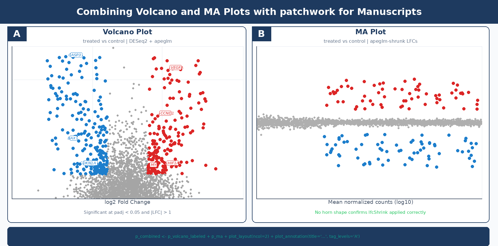
The two plots together answer the two most important questions about any differential expression result: what changed significantly, and is the analysis trustworthy? The volcano gives the first answer. The MA gives the second.
NotchBio generates both plots automatically as part of the pipeline output alongside the DESeq2 results table, using apeglm-shrunk fold changes for both. If you want the full analysis without writing the R code, upload your count matrix at notchbio.app.
Further reading
Read another related post
Bulk RNA-Seq Is Not Dead: When To Use It Over scRNA-Seq
Single-cell RNA-seq dominates conferences but bulk RNA-seq remains the right tool for most experiments. A decision framework for choosing your modality.
TutorialDetecting and Correcting Batch Effects in Bulk RNA-Seq
A tutorial on spotting batch effects with PCA, modeling them in DESeq2, and when to reach for ComBat-Seq, RUVSeq, or sva instead. Real code, real plots.
BioinformaticsWhat The 2025-2026 Bioinformatics Hiring Shift Means For Your Workflow
Entry-level pipeline jobs are vanishing and AI-skilled senior roles are rising. What the 2025-2026 hiring shift signals about structuring RNA-seq work.