Pathway Visualization in Python
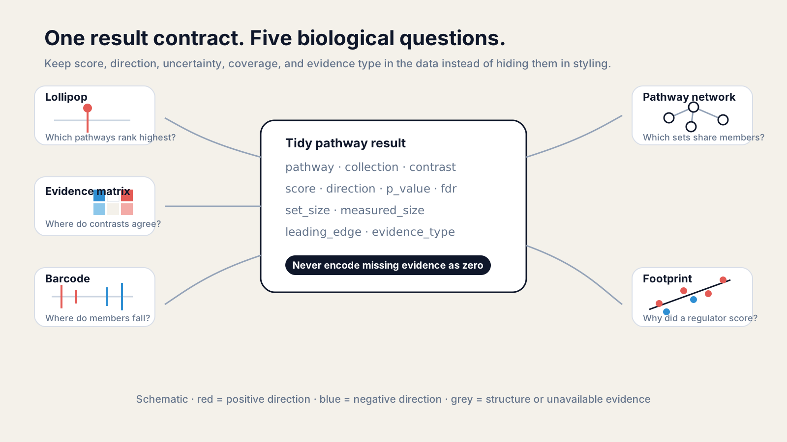
Pathway visualization in Python starts with one tidy result table, then chooses a plot for a specific question. The figure must preserve direction, uncertainty, coverage, evidence type, and missingness.
A dot plot alone rarely explains a pathway result. A ranking answers “which pathways?”, a barcode answers “where are the genes?”, a matrix answers “where do conditions agree?”, and a footprint answers “why did this model score?”
This tutorial builds those views with deterministic Python. The data are synthetic, so the figures teach the contract without presenting an invented biological discovery.
What data does pathway visualization need?
A pathway figure needs stable pathway identity, contrast, score, uncertainty, coverage, and evidence type. Keep those fields in tidy rows before choosing colors, sizes, or layouts.
At minimum, store pathway, collection, contrast, score, p_value, fdr, set_size, measured_size, and evidence_type. Add leading_edge only when the method defines it.
score is not universal. A GSEA normalized enrichment score, a rank-sum z score, a topology perturbation score, and a regulator activity t statistic have different meanings. Never place them on one axis without an explicit transformation and justification.
Use one row per pathway, contrast, and evidence layer. This prevents a join from silently replacing enrichment with topology or treating an absent topology result as a measured zero.
Add a status column before plotting. Useful values include tested, not_evaluable, unsupported, and failed. A renderer can then show a mark, an empty cell, or an explanatory symbol without guessing from the numeric columns.
Keep the tested gene universe and pathway-library version in sidecar metadata. Two rows with the same pathway label are not necessarily comparable if one analysis measured fewer genes or used a later pathway definition.
Store a machine-readable list for leading_edge, not a comma-separated display string. The list can feed a barcode or member table without reparsing labels that may themselves contain punctuation.
Before drawing, ask three questions: what is the unit of one row, what generated the score, and what does a missing value mean? If those answers are unclear, styling the table will only make the ambiguity harder to see.
Install the plotting stack, then run the examples in order:
python -m pip install pandas matplotlib networkximport numpy as npimport pandas as pdimport matplotlib.pyplot as pltimport networkx as nx
UP = "#e45b55"DOWN = "#2f8fd3"INK = "#0f172a"MUTED = "#64748b"BORDER = "#d8dee8"
rows = [ ("Interferon response", "Hallmark", "Drug A", 2.4, 0.0007, 0.004, 186, 151), ("Hypoxia", "Hallmark", "Drug A", 1.5, 0.011, 0.031, 100, 82), ("Cell cycle", "Reactome", "Drug A", 0.7, 0.09, 0.18, 142, 118), ("Oxidative stress", "GO", "Drug A", -1.2, 0.06, 0.12, 95, 70), ("ECM organization", "Reactome", "Drug A", -2.2, 0.001, 0.008, 210, 167), ("Translation", "Reactome", "Drug A", -3.0, 0.0002, 0.002, 165, 144),]
df = pd.DataFrame(rows, columns=[ "pathway", "collection", "contrast", "score", "p_value", "fdr", "set_size", "measured_size"])df["direction"] = np.where(df["score"] > 0, "positive", "negative")df["evidence_type"] = "directional_enrichment"df["status"] = "tested"Record missingness explicitly
Use NaN for an untested or unavailable score, plus a status such as not_evaluable, unsupported, or request_failed. Zero should mean the method measured a value of zero.
How do you build a pathway lollipop plot?
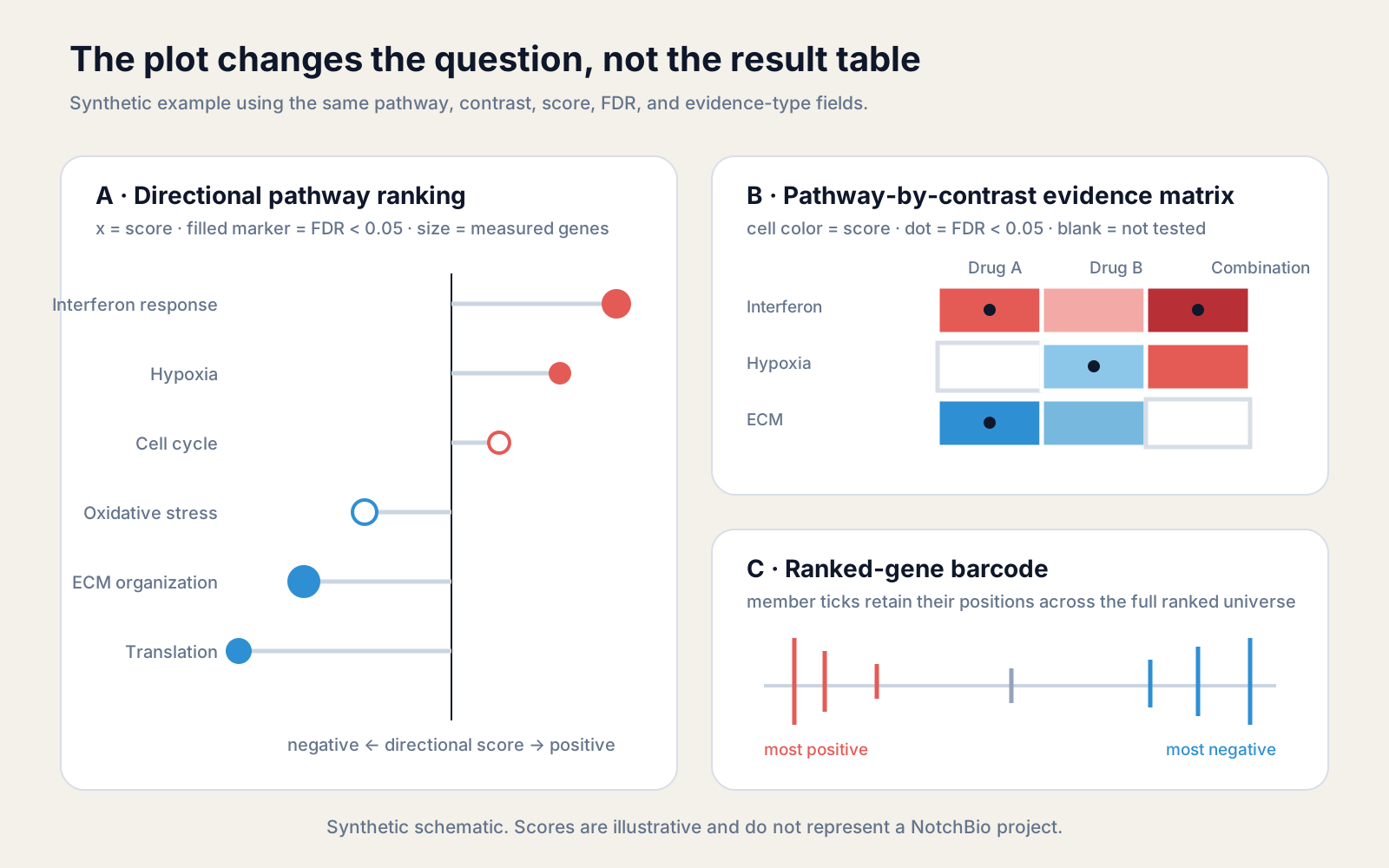
A pathway lollipop plot ranks signed scores around a visible zero line. The stem shows distance from zero, while marker fill, size, and color can encode separate, named fields.
Sort by score, not by label. Put the pathway names on the y-axis because long biological labels are easier to scan horizontally.
Use fill for a binary FDR decision only if the exact threshold appears in the caption. Keep the numeric FDR in the table or tooltip because a threshold discards information.
plot_df = df.sort_values("score")colors = np.where(plot_df["score"] >= 0, UP, DOWN)sizes = 45 + 0.55 * plot_df["measured_size"]
fig, ax = plt.subplots(figsize=(9, 5.4))for y, (_, row) in enumerate(plot_df.iterrows()):    color = UP if row.score >= 0 else DOWN    ax.hlines(y, 0, row.score, color=BORDER, linewidth=2)    ax.scatter(        row.score, y, s=sizes.iloc[y],        facecolor=color if row.fdr < 0.05 else "white",        edgecolor=color, linewidth=1.8, zorder=3    )
ax.axvline(0, color=INK, linewidth=1)ax.set_yticks(range(len(plot_df)), plot_df["pathway"])ax.set_xlabel("Directional enrichment score")ax.spines[["top", "right", "left"]].set_visible(False)fig.tight_layout()lollipop_fig = fig
The sign here means positive or negative directional enrichment. It does not mean predicted pathway activation unless the score came from a signed topology or regulator model.
The most important visual channel is position along the common axis. Color should reinforce polarity, not carry direction by itself. A reader printing in grayscale should still see which side of zero a pathway occupies.
Marker size is appropriate for measured set size only when the legend gives reference sizes. Area, not radius, should scale with the data; otherwise large pathways become visually exaggerated.
FDR is uncertainty after multiple testing, not effect magnitude. A pathway can have a large signed score and weak FDR because coverage is poor or variation is high. Hollow markers make that tension visible without deleting the row.
How do you visualize pathway direction and FDR together?
Show pathway direction on a zero-centered axis and FDR through a second channel. A matrix works across contrasts; a lollipop works within one contrast.
For an evidence matrix, color can encode a signed score and a dot can mark FDR < 0.05. Keep blank cells for pathways that were not tested or could not be evaluated.
extra = pd.DataFrame([    ("Interferon response", "Drug B", 0.8, 0.11),    ("Interferon response", "Combination", 3.1, 0.001),    ("Hypoxia", "Drug B", -1.4, 0.02),    ("Hypoxia", "Combination", 1.7, 0.04),    ("ECM organization", "Drug B", -1.1, 0.08),], columns=["pathway", "contrast", "score", "fdr"])
matrix_df = pd.concat([    df[["pathway", "contrast", "score", "fdr"]], extra], ignore_index=True)
score_mat = matrix_df.pivot(index="pathway", columns="contrast", values="score")fdr_mat = matrix_df.pivot(index="pathway", columns="contrast", values="fdr")
fig, ax = plt.subplots(figsize=(7.2, 4.8))masked = np.ma.masked_invalid(score_mat.to_numpy())limit = np.nanmax(np.abs(score_mat.to_numpy(dtype=float)))image = ax.imshow(masked, cmap="RdBu_r", vmin=-limit, vmax=limit, aspect="auto")
for y in range(score_mat.shape[0]):    for x in range(score_mat.shape[1]):        if pd.notna(fdr_mat.iloc[y, x]) and fdr_mat.iloc[y, x] < 0.05:            ax.scatter(x, y, s=28, color=INK)
ax.set_xticks(range(score_mat.shape[1]), score_mat.columns, rotation=25, ha="right")ax.set_yticks(range(score_mat.shape[0]), score_mat.index)fig.colorbar(image, ax=ax, label="Directional score")fig.tight_layout()
Do not compare raw scores across method families just because both are signed. Facet enrichment, topology, and regulator activity, or use independent axes with method-specific labels.
Use a diverging scale centered at zero when both directions matter. Fix the limits symmetrically around the largest absolute score so equal positive and negative values receive equal color intensity.
Do not let one extreme cell flatten the rest of the matrix without inspection. A clipped display range can help, but the caption must state the clipping rule and the downloadable table must retain the original values.
Order rows by a declared rule: pathway family, hierarchical clustering, mean score, or a reference contrast. Reordering each column independently destroys row correspondence and makes agreement impossible to assess.
If methods were run on different pathway collections, join by collection plus stable pathway identity. Name similarity is not enough; two labels can describe overlapping but nonidentical models.
How do you draw a ranked-gene barcode?
A ranked-gene barcode places pathway members along the full ordered gene universe. It reveals whether members cluster near one extreme, spread diffusely, or occupy both ends.
The barcode needs the same ranking used by the pathway test. Re-sorting genes by fold change after testing with a Wald statistic changes the visual question.
rng = np.random.default_rng(17)gene_stats = pd.Series(rng.normal(size=600), name="stat").sort_values(ascending=False)member_ranks = np.array([8, 19, 33, 52, 88, 270, 431, 512, 570])
fig, ax = plt.subplots(figsize=(9, 1.8))for rank in member_ranks:    color = UP if gene_stats.iloc[rank] >= 0 else DOWN    ax.vlines(rank, 0, 1, color=color, linewidth=2)
ax.axhline(0.5, color=BORDER, linewidth=1)ax.set_xlim(0, len(gene_stats) - 1)ax.set_yticks([])ax.set_xlabel("Genes ordered by the pathway test statistic")ax.spines[["top", "right", "left"]].set_visible(False)fig.tight_layout()
A tick means membership, not individual significance. A leading edge is a method-defined subset that drives the running enrichment signal; it should not be invented for tests that do not define one.
Dense pathways may place several genes in the same pixel. Bin nearby ranks into a signed density strip or add alpha rather than drawing opaque ticks on top of one another.
Keep the full ranking length on the x-axis. Cropping to the pathway members removes the background against which concentration is judged and turns the barcode into an uninformative list.
Use the sign of the original ranking metric for tick color only when that metric has a meaningful zero. Rank position already carries the main evidence; color should not imply an extra statistical test.
How do you build a pathway network?
A pathway network connects sets through an explicit edge rule, such as Jaccard overlap. State the rule in the legend because shared genes, co-expression, regulation, and graph adjacency are different relationships.
Jaccard similarity divides the number of shared genes by the size of the union. It limits the tendency of a large pathway to look related to everything simply because it contains many genes.
pathway_genes = {    "Interferon": {"STAT1", "STAT2", "IRF1", "IRF7", "ISG15"},    "Antiviral": {"STAT1", "IRF7", "ISG15", "OAS1", "MX1"},    "Inflammation": {"STAT1", "IRF1", "NFKB1", "TNF", "IL6"},    "ECM": {"COL1A1", "COL3A1", "MMP2", "ITGB1"},}
graph = nx.Graph()for name, genes in pathway_genes.items():    graph.add_node(name, set_size=len(genes))
names = list(pathway_genes)for i, left in enumerate(names):    for right in names[i + 1:]:        a, b = pathway_genes[left], pathway_genes[right]        jaccard = len(a & b) / len(a | b)        if jaccard >= 0.15:            graph.add_edge(left, right, jaccard=jaccard)
positions = nx.spring_layout(graph, seed=17, weight="jaccard")widths = [1 + 8 * graph.edges[e]["jaccard"] for e in graph.edges]nx.draw_networkx(graph, positions, width=widths, node_color="white",                 edgecolors=INK, edge_color=BORDER, font_size=9)plt.axis("off")
NetworkX provides basic drawing, but its documentation recommends dedicated graph-visualization tools for complex figures. Export GraphML when dense networks need Cytoscape, Gephi, or Graphviz rather than forcing every label into Matplotlib.
The PLOS guidance for biological network figures recommends defining the message first, then choosing layout, labels, aggregation, colors, and layers. That order is more reliable than styling a hairball after it appears.
Save the edge definition in the exported table. A useful edge row contains source, target, metric, weight, overlap_count, and the pathway versions used to calculate it.
Choose the threshold before viewing the final layout, or report a sensitivity view. Raising the Jaccard cutoff only until the network looks tidy can remove inconvenient relationships and exaggerate separation.
Force-directed coordinates are presentation, not evidence. Two nodes being close on the page does not add a biological relation beyond the edges supplied to the layout algorithm.
For a dense network, label selected pathways directly and provide the complete node and edge tables separately. Tiny labels and hundreds of pale edges create the appearance of complexity while hiding the actual comparison.
How do you plot a regulator footprint?
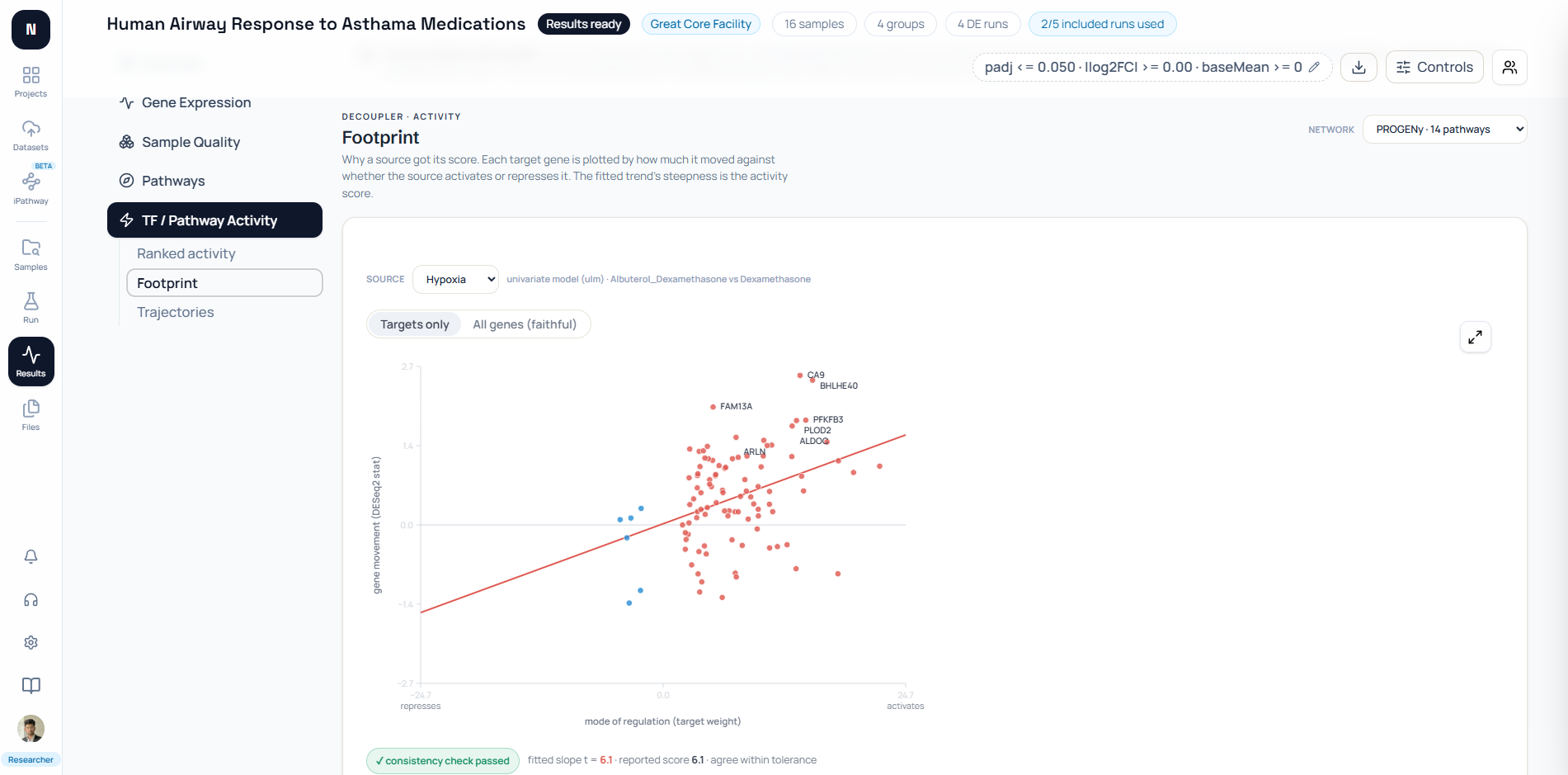
A regulator footprint plots prior target weights against observed gene-level statistics. The fitted trend makes the activity score auditable, while coverage shows whether enough targets support it.
Positive weights represent targets expected to move with the source; negative weights represent inverse targets. The y-axis should contain the same observed statistic supplied to the activity model.
rng = np.random.default_rng(23)target_weight = np.linspace(-1.0, 1.0, 50)gene_stat = 1.8 * target_weight + rng.normal(0, 0.55, target_weight.size)slope, intercept = np.polyfit(target_weight, gene_stat, 1)
fig, ax = plt.subplots(figsize=(6.8, 5.2))point_colors = np.where(target_weight >= 0, UP, DOWN)ax.scatter(target_weight, gene_stat, c=point_colors, alpha=0.82)xline = np.array([target_weight.min(), target_weight.max()])ax.plot(xline, intercept + slope * xline, color=INK, linewidth=2)ax.axhline(0, color=BORDER, linewidth=1)ax.axvline(0, color=BORDER, linewidth=1)ax.set(xlabel="Prior target weight", ylabel="Observed gene statistic")fig.tight_layout()
The fitted association measures agreement with a prior-knowledge model. It does not prove that the regulator caused the observed transcriptional changes or directly measure phosphorylation, binding, or pathway flux.
Show target coverage beside the footprint. A steep line supported by five measured targets is less robust than the same trend supported by fifty, especially if one point has high leverage.
Label only influential or unexpected targets. Labeling every gene makes the residual pattern unreadable; a separate table can carry gene names, weights, statistics, and residuals.
Inspect both activating and repressing targets. A model can achieve a positive score when positively weighted targets move up and negatively weighted targets move down; omitting one side hides how the score was earned.
A confidence band can describe uncertainty in the fitted relation, but it does not turn the footprint into an intervention. The prior network and expression contrast still define an observational model comparison.
How do you compare pathway scores across conditions?
Compare conditions on a shared scale only when the score definition, pathway version, and model settings match. Otherwise standardize within a defensible analysis unit or facet the views.
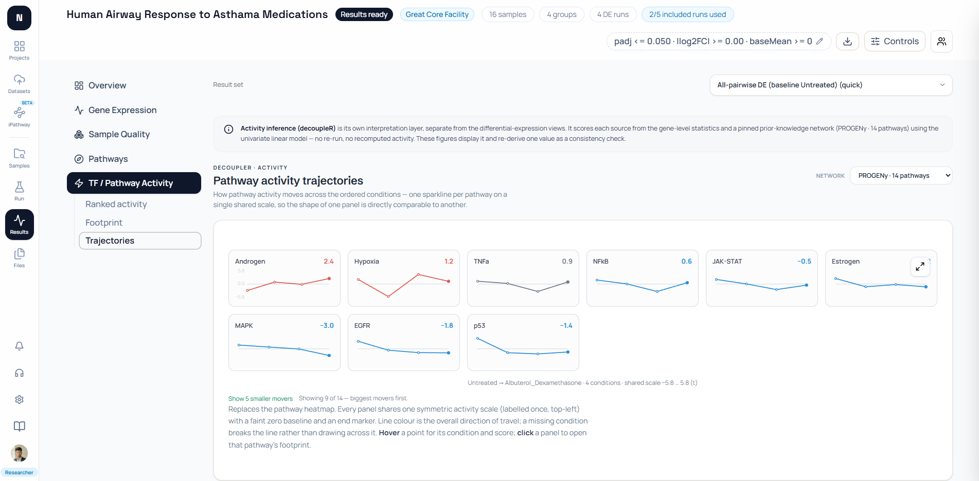
For several pathways and contrasts, a matrix gives the best overview. For an ordered dose, time, or treatment sequence, small multiples can show trajectories without overlapping many lines.
Keep the same symmetric y-limit in every small multiple. A separate autoscale can make a small change look as large as the strongest response.
Missing values should break a line. Connecting across an unmeasured condition visually invents continuity and can hide a failed or unsupported result.
Condition order must be data, not decoration. Encode dose, time, or a declared treatment sequence in a column and sort from that field rather than relying on alphabetical labels.
Repeated measurements need uncertainty. Add replicate-level points, confidence intervals, or model-derived standard errors where the score supports them; a line through group means alone hides variation.
For unrelated categorical conditions, prefer a matrix or dot plot over a trajectory. A connecting line suggests continuity and can imply an ordering that the experiment never tested.
If a shared scale compresses nearly all pathways, show an overview plus a focused panel. Do not give each pathway a private scale and then invite direct magnitude comparison.
When comparing independent studies, retain complete score tables instead of intersecting only significant pathways. Thresholded lists create false disagreements when nearly identical estimates fall on opposite sides of an FDR cutoff.
For the full statistical workflow behind those scores, read Pathway Enrichment Analysis: GSEA and ORA in R and Python and ORA vs GSEA with clusterProfiler.
How do you export SVG and PNG correctly?
Export SVG for editable labels and vector marks, plus a high-resolution PNG for systems that rasterize uploads. Generate both from the same figure object and settings.
Matplotlib selects the output format from the filename or the format argument. Its official savefig documentation also exposes DPI, bounding-box, face-color, and metadata controls.
lollipop_fig.savefig( "pathway-lollipop.svg", format="svg", bbox_inches="tight", facecolor="white", metadata={"Title": "Directional pathway ranking"},)lollipop_fig.savefig( "pathway-lollipop.png", dpi=300, bbox_inches="tight", facecolor="white",)Set physical figure size before saving. Raising DPI increases raster pixels but does not repair labels that were too small in the original layout.
Inspect the SVG and PNG after export. Check clipped pathway names, minus signs, superscripts, marker borders, legend wording, and whether red and blue still differ in print or under color-vision deficiency.
SVG keeps text and geometry editable, but fonts can substitute on another computer. Use common font families, embed fonts when licensing permits, or convert final publication text to paths while preserving an editable source copy.
PNG is appropriate for slides, previews, and systems that reject SVG. Export at the final aspect ratio; resizing a wide pathway matrix into a narrow column can make its labels unreadable even at 300 DPI.
Include a small data or method identifier in the filename, such as the contrast and evidence layer. figure-final-v2.png does not reveal which result produced it and is easy to reuse incorrectly.
Keep the script, input table, package versions, and output together. Reproducible computational research requires tracking how each result was produced, not merely preserving the exported picture.
The PLOS color guidance recommends matching color to data type, checking context and accessibility, and testing print behavior. Direction should also remain readable through position, labels, or marker form.
How does NotchBio design the same views?
NotchBio coordinates pathway and gene views around one selected comparison and pathway scope. It keeps directional enrichment, topology propagation, member expression, and regulator activity as separate evidence layers.
The Pathways ranking uses a CAMERA-corrected rank-sum z score. Its lollipop places the score on a zero-centered axis, marker size represents set size, and color represents −log10(FDR).
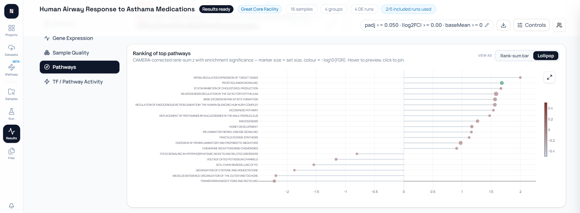
Behind that view, genesets_enrichment.py computes a signed rank-sum statistic and optional sparse barcodes. The barcode bins pathway members along the same signed-metric order used by the pathway detail view, so the summary strip and drill-down do not silently reorder genes.
The Results workspace passes the functional report’s ordered pathway IDs into recurring-gene and member-expression requests. That keeps downstream panels aligned with the visible CAMERA-corrected ranking instead of recomputing a competing top list.
NotchBio’s pathways-by-samples heatmap is a row-standardized mean of member-gene VST z scores. It is labeled as a member-expression pattern, not canonical ssGSEA, GSVA, or causal pathway activation.
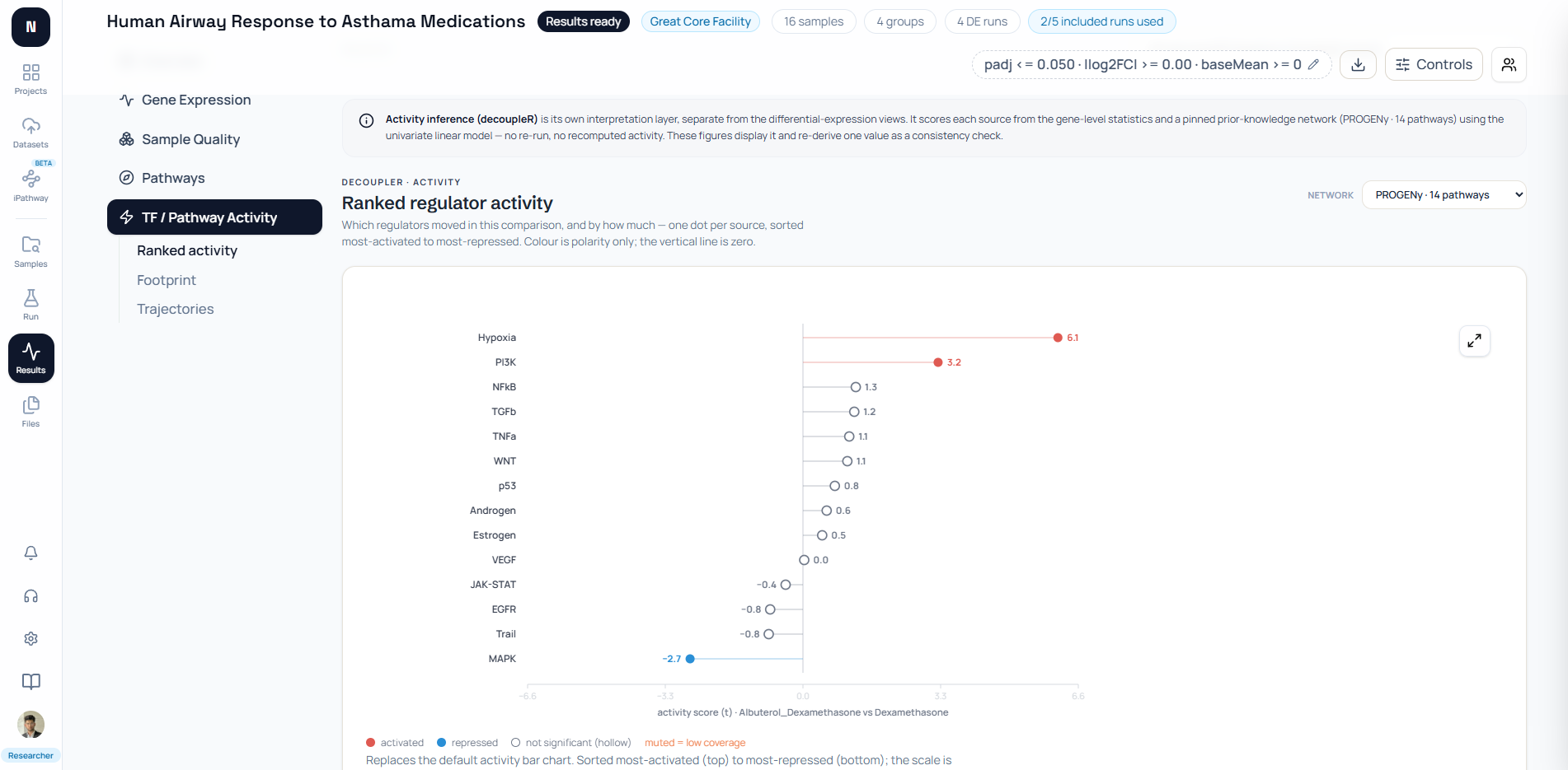
The TF / Pathway Activity workspace is different. It uses weighted prior-knowledge targets, displays a ranked activity score, and exposes the footprint that re-derives the score from target weights and gene statistics.
The aligned evidence map also keeps enrichment and topology on independent zero-centered axes. Exact pathway identity permits row alignment, but the interface does not manufacture one omnibus score.
AlignedEvidencePlot.tsx draws method-specific lollipops and uses filled or hollow markers for each method’s own FDR result. Pending, failed, unsupported, and not-evaluable topology replace the topology mark instead of appearing at zero.
PathwaysOverview.tsx coordinates a pinned pathway across the barcode, member-gene volcano, alternate rankings, leading-edge table, recurring-gene view, and member-expression heatmap. Those linked views answer related questions without pretending they are one statistic.
figures.tsx uses custom SVG for ranked regulator activity and its footprint. The zero line, hollow nonsignificant markers, low-coverage states, and target-level consistency check are deliberate parts of the evidence display.
The product captures here prove those interface semantics for one demonstration result. Their visible pathway values should not be treated as defaults, benchmarks, or expected biology for another experiment.
Which pathway visualization should you use?
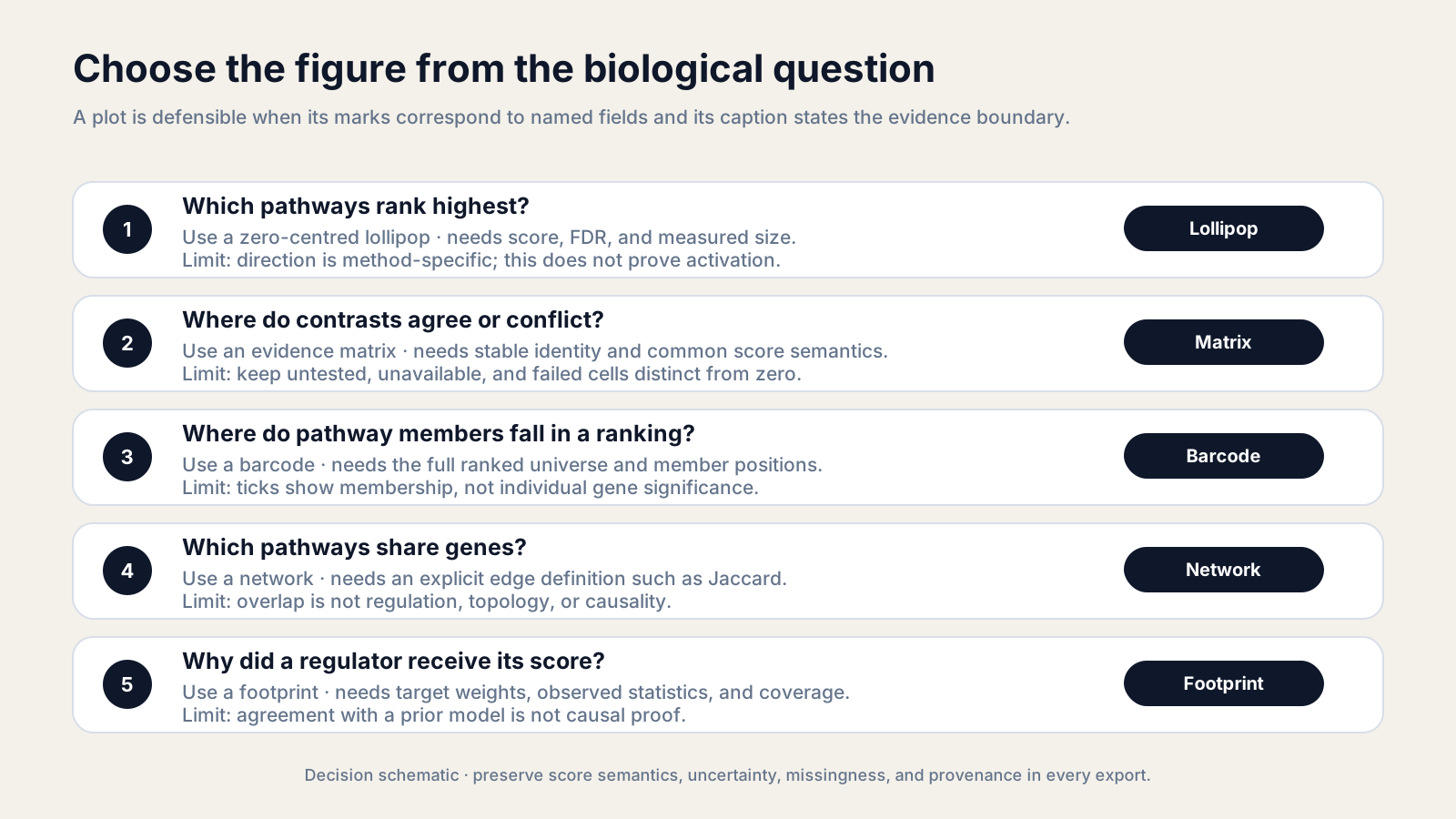
Use the smallest figure that answers the question without collapsing evidence layers. Add a linked view only when it exposes a different decision or failure mode.
| Reader question | Best first view | Required fields | Main warning |
|---|---|---|---|
| Which pathways rank highest? | Zero-centered lollipop | score, FDR, measured size | Direction is method-specific |
| Where do contrasts agree? | Evidence matrix | stable pathway ID, contrast, score, status | Missing is not zero |
| Where do members fall? | Ranked-gene barcode | full ranking, member positions | Membership is not gene significance |
| Which pathways overlap? | Network | gene sets, named edge metric | Overlap is not regulation |
| Why did a source score? | Regulator footprint | weights, gene statistics, coverage | Model agreement is not causality |
For publication, accompany every figure with the complete result table, method label, collection and version, contrast, thresholds, tested universe, and export settings. A visually simple panel can still carry a rigorous audit trail.
Write the caption before polishing the plot. If the caption cannot state the figure’s question, encodings, method, and limitation in a few sentences, the figure probably combines too many messages.
Use direct labels for the few pathways that matter to the argument. Put exhaustive values in a table and keep exploratory interactivity separate from the static figure submitted with a manuscript.
Finally, ask a colleague to interpret the plot without your narration. Their first wrong inference identifies the legend, label, or evidence boundary that needs revision.
Start with How to Compare Pathways Across Datasets if you still need the tidy comparison contract used by these figures.
The next article applies the comparison and visualization rules to cell line pathway analysis, where baseline differences, additive adjustment, and treatment-by-cell-line interactions must stay distinct.
Further reading
Read another related post
RNA-Seq Results Checklist for Publication and Peer Review
Reviewers reject RNA-seq papers for predictable reasons: missing FDR correction, version-less methods, inaccessible data. A checklist that prevents it.
Research GuideHow to Write an RNA-Seq Methods Section: Template and Checklist
A reviewer-proof RNA-seq methods section is shorter than you think but far more specific. Templates, required elements, and what reviewers always flag missing.
Research GuideWhy RNA-Seq Analyses Fail to Reproduce—and How to Fix Them
Half of published RNA-seq pipelines fail when someone else tries to run them. A practitioner view of what breaks and how to build for reproducibility.