RNA-Seq Plots: Volcano, MA, and Heatmap in R and Python
Most RNA-seq volcano plots in the wild look the same. Dark background, rainbow colors, a thousand overlapping gene labels, no axis text size you can read at journal resolution.
Reviewers notice. Editors notice. A clean, well-labeled figure communicates confidence in your analysis. A cluttered one suggests the opposite.
This tutorial covers the three plots that belong in every bulk RNA-seq paper: the volcano plot, the MA plot, and the top-DEG heatmap. Both R and Python versions are included. The goal is code you can drop into your own analysis, adjust two color variables, and submit directly.
We use the DESeq2 results from How to Run DESeq2 in R and the PyDESeq2 results from From Salmon Output to DEGs in Python with PyDESeq2. Both analyses produce a CSV with symbol, baseMean, log2FoldChange, lfcSE, pvalue, and padj columns, so the plotting code is interchangeable.
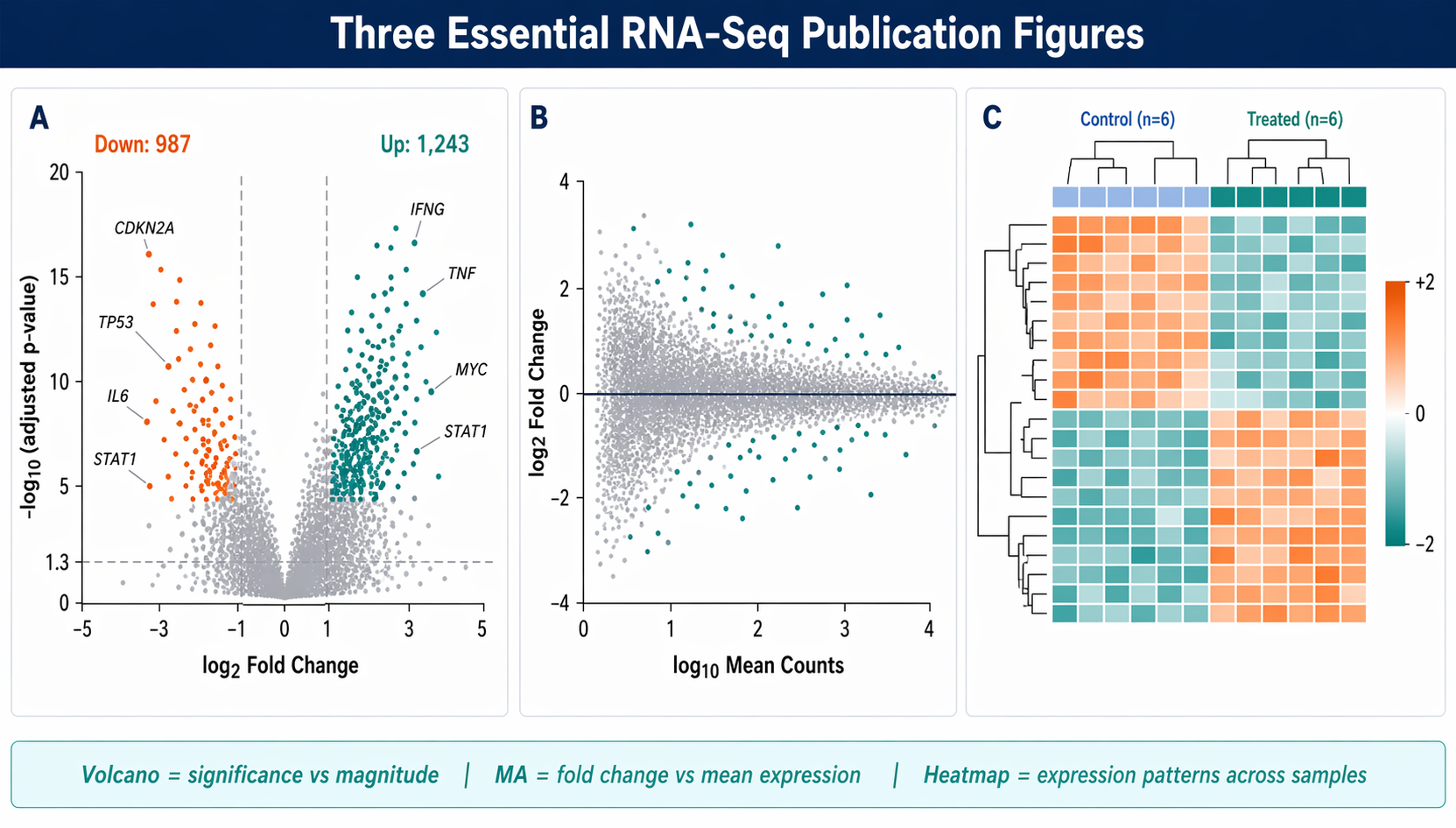
What Each Plot Shows (and When to Use It)
Before writing code, it is worth being clear on what each figure actually communicates.
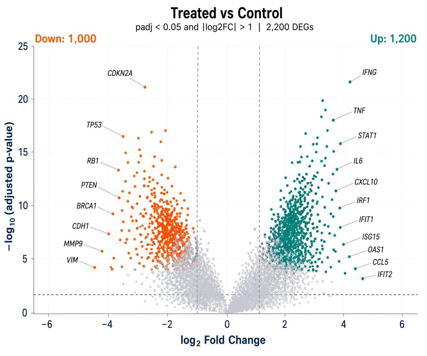
A volcano plot plots significance (as negative log10 of adjusted p-value) against effect size (log2 fold change). It answers: which genes are both statistically significant and biologically meaningful in magnitude? The horizontal threshold marks your FDR cutoff. The vertical thresholds mark your fold-change cutoff.
An MA plot plots mean expression (the A) against fold change (the M). It is better than a volcano plot for diagnosing bias. If the fold changes systematically drift away from zero at low count levels, your normalization failed or you have a strong composition effect. The cloud should center symmetrically around zero.
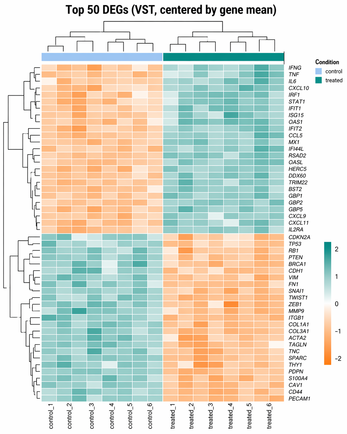
A DEG heatmap shows the expression pattern of your top differentially expressed genes across all samples. It answers: do the expression patterns make biological sense? It also reveals any remaining batch structure or outlier samples that the statistical model may have partially absorbed.
How to Make a Publication-Quality Volcano Plot in R
Load the DESeq2 results CSV from the DESeq2 walkthrough and build a labeled volcano plot with ggplot2 and ggrepel.
library(ggplot2)library(ggrepel)library(dplyr)library(readr)
# Load resultsres <- read_csv("results/deseq2/all_genes.csv") |>  filter(!is.na(padj), !is.na(log2FoldChange))
# ── Classify genes ───────────────────────────────────────────────────res <- res |>  mutate(    significance = case_when(      padj < 0.05 & log2FoldChange >  1 ~ "Up",      padj < 0.05 & log2FoldChange < -1 ~ "Down",      TRUE                               ~ "NS"    ),    # Only label the top 15 genes by absolute LFC among significant genes    label = ifelse(      significance != "NS" &        rank(-abs(log2FoldChange)) <= 15,      symbol, NA_character_    )  )
# Count DEGs for annotationn_up   <- sum(res$significance == "Up",   na.rm = TRUE)n_down <- sum(res$significance == "Down", na.rm = TRUE)
# ── Build the plot ───────────────────────────────────────────────────pal <- c("Up" = "#0D9488", "Down" = "#F97316", "NS" = "#CBD5E1")
p <- ggplot(res, aes(    x     = log2FoldChange,    y     = -log10(padj),    color = significance,    label = label  )) +
  # Points: non-significant first (drawn below), then significant  geom_point(    data  = filter(res, significance == "NS"),    size  = 0.8, alpha = 0.4  ) +  geom_point(    data  = filter(res, significance != "NS"),    size  = 1.2, alpha = 0.85  ) +
  # Threshold lines  geom_hline(yintercept = -log10(0.05), linetype = "dashed",             color = "#64748B", linewidth = 0.5) +  geom_vline(xintercept = c(-1, 1), linetype = "dashed",             color = "#64748B", linewidth = 0.5) +
  # Gene labels (ggrepel avoids overlap)  geom_text_repel(    na.rm         = TRUE,    size          = 3,    fontface      = "italic",    color         = "black",    box.padding   = 0.4,    point.padding = 0.3,    max.overlaps  = 20,    segment.color = "#94A3B8",    segment.size  = 0.3  ) +
  # DEG counts in corners  annotate("text", x =  max(res$log2FoldChange, na.rm = TRUE) * 0.85,           y = max(-log10(res$padj), na.rm = TRUE) * 0.95,           label = paste0("Up: ", n_up), color = "#0D9488",           hjust = 1, size = 3.5, fontface = "bold") +  annotate("text", x = -max(res$log2FoldChange, na.rm = TRUE) * 0.85,           y = max(-log10(res$padj), na.rm = TRUE) * 0.95,           label = paste0("Down: ", n_down), color = "#F97316",           hjust = 0, size = 3.5, fontface = "bold") +
  scale_color_manual(values = pal, guide = "none") +  scale_x_continuous(limits = c(-6, 6), oob = scales::squish) +  labs(    title    = "Treated vs Control",    subtitle = paste0("padj < 0.05 and |log2FC| > 1  |  ",                      n_up + n_down, " DEGs"),    x        = expression(log[2]~"Fold Change"),    y        = expression(-log[10]~"(adjusted p-value)")  ) +  theme_minimal(base_size = 12) +  theme(    panel.grid.minor = element_blank(),    panel.grid.major = element_line(color = "#F1F5F9", linewidth = 0.4),    plot.title       = element_text(face = "bold", size = 13),    axis.text        = element_text(color = "#1E3A5F"),    axis.title       = element_text(color = "#1E3A5F", face = "bold")  )
# ── Export at 300 dpi ────────────────────────────────────────────────ggsave("results/figures/volcano_plot.pdf",       plot   = p,       width  = 6,       height = 5,       dpi    = 300,       device = "pdf")
ggsave("results/figures/volcano_plot.png",       plot   = p,       width  = 6,       height = 5,       dpi    = 300)
Use PDF, not PNG, for journal submission
Most journals require vector figures. Export as PDF with device = "pdf" in ggsave(). PDF preserves exact font rendering, hairline weights, and point sharpness at any print resolution. The PNG version is useful for presentations and preprints. Keep both.
How to Make a Volcano Plot in Python
For teams working entirely in Python, matplotlib and adjustText replicate the same output.
import pandas as pdimport numpy as npimport matplotlib.pyplot as pltimport matplotlib.patches as mpatchesfrom adjustText import adjust_text
# Load resultsres = pd.read_csv("results/pydeseq2/all_genes.csv")res = res.dropna(subset=["padj", "log2FoldChange"])
# ── Classify ──────────────────────────────────────────────────────────def classify(row):    if row["padj"] < 0.05 and row["log2FoldChange"] >  1: return "Up"    if row["padj"] < 0.05 and row["log2FoldChange"] < -1: return "Down"    return "NS"
res["significance"] = res.apply(classify, axis=1)res["neg_log10_padj"] = -np.log10(res["padj"].clip(lower=1e-300))
# Top 15 genes to labeltop_genes = (    res[res["significance"] != "NS"]    .nlargest(15, "log2FoldChange", keep="all")    .index.tolist())
# ── Plot ──────────────────────────────────────────────────────────────colors = {"Up": "#0D9488", "Down": "#F97316", "NS": "#CBD5E1"}
fig, ax = plt.subplots(figsize=(6, 5))
for sig, grp in res.groupby("significance"):    alpha = 0.4 if sig == "NS" else 0.85    size  = 8   if sig == "NS" else 12    ax.scatter(grp["log2FoldChange"], grp["neg_log10_padj"],               c=colors[sig], s=size, alpha=alpha, linewidths=0, zorder=2 if sig != "NS" else 1)
# Threshold linesax.axhline(-np.log10(0.05), color="#64748B", lw=0.8, ls="--", zorder=0)ax.axvline(-1,               color="#64748B", lw=0.8, ls="--", zorder=0)ax.axvline( 1,               color="#64748B", lw=0.8, ls="--", zorder=0)
# Gene labelstexts = []for idx in top_genes:    row = res.loc[idx]    if pd.notna(row.get("symbol")):        texts.append(ax.text(row["log2FoldChange"], row["neg_log10_padj"],                             row["symbol"], fontsize=7, fontstyle="italic"))adjust_text(texts, ax=ax, arrowprops=dict(arrowstyle="-", color="#94A3B8", lw=0.5))
n_up   = (res["significance"] == "Up").sum()n_down = (res["significance"] == "Down").sum()ax.text(0.97, 0.97, f"Up: {n_up}",   transform=ax.transAxes,        ha="right", va="top", color="#0D9488", fontweight="bold", fontsize=9)ax.text(0.03, 0.97, f"Down: {n_down}", transform=ax.transAxes,        ha="left",  va="top", color="#F97316", fontweight="bold", fontsize=9)
ax.set_xlabel(r"$\log_2$ Fold Change", fontsize=11, fontweight="bold")ax.set_ylabel(r"$-\log_{10}$(adjusted p-value)", fontsize=11, fontweight="bold")ax.set_title("Treated vs Control", fontsize=12, fontweight="bold")ax.set_xlim(-6, 6)ax.spines[["top", "right"]].set_visible(False)
plt.tight_layout()plt.savefig("results/figures/volcano_plot.pdf", dpi=300)plt.savefig("results/figures/volcano_plot.png", dpi=300)
Install adjustText for non-overlapping Python labels
adjustText is not included in the base rnaseq environment. Install it with pip install adjustText. It is the Python equivalent of ggrepel and works with any matplotlib scatter plot.
How to Make an MA Plot in R and Python
The MA plot is often skipped in favor of the volcano, which is a mistake. The volcano tells you which genes are significant. The MA plot tells you whether your normalization is working.
R version
library(ggplot2)
# Use the full results including non-significant genesres_ma <- res |>  mutate(    sig     = padj < 0.05 & abs(log2FoldChange) > 1,    label_ma = ifelse(sig & rank(-abs(log2FoldChange)) <= 10,                      symbol, NA_character_)  )
p_ma <- ggplot(res_ma, aes(    x     = log10(baseMean + 1),    y     = log2FoldChange,    color = sig,    label = label_ma  )) +  geom_point(aes(alpha = sig), size = 0.8) +  scale_alpha_manual(values = c("FALSE" = 0.3, "TRUE" = 0.85), guide = "none") +  scale_color_manual(    values = c("FALSE" = "#CBD5E1", "TRUE" = "#0D9488"),    labels = c("Not significant", "DEG (padj<0.05, |LFC|>1)"),    name   = NULL  ) +  geom_hline(yintercept = 0, color = "#1E3A5F", linewidth = 0.5) +  geom_text_repel(    na.rm       = TRUE, size = 2.8, fontface = "italic",    color       = "black", box.padding = 0.4, max.overlaps = 15,    segment.color = "#94A3B8", segment.size = 0.3  ) +  labs(    title = "MA Plot: Treated vs Control (apeglm shrinkage)",    x     = expression(log[10]~"Mean Normalized Count"),    y     = expression(log[2]~"Fold Change")  ) +  theme_minimal(base_size = 12) +  theme(    legend.position  = "bottom",    panel.grid.minor = element_blank(),    panel.grid.major = element_line(color = "#F1F5F9")  )
ggsave("results/figures/ma_plot.pdf", p_ma,       width = 6, height = 5, dpi = 300, device = "pdf")
Python version
fig, ax = plt.subplots(figsize=(6, 5))
# Non-significantns = res[res["significance"] == "NS"]ax.scatter(np.log10(ns["baseMean"] + 1), ns["log2FoldChange"],           c="#CBD5E1", s=6, alpha=0.3, linewidths=0, zorder=1)
# Significant DEGssig = res[res["significance"] != "NS"]ax.scatter(np.log10(sig["baseMean"] + 1), sig["log2FoldChange"],           c="#0D9488", s=10, alpha=0.8, linewidths=0, zorder=2)
ax.axhline(0, color="#1E3A5F", lw=0.8, zorder=3)ax.set_xlabel(r"$\log_{10}$(Mean Normalized Count)", fontsize=11, fontweight="bold")ax.set_ylabel(r"$\log_2$ Fold Change", fontsize=11, fontweight="bold")ax.set_title("MA Plot: Treated vs Control", fontsize=12, fontweight="bold")ax.spines[["top", "right"]].set_visible(False)
plt.tight_layout()plt.savefig("results/figures/ma_plot.pdf", dpi=300)
How to Make a Top-DEG Expression Heatmap with pheatmap
A heatmap of DEG expression should use variance-stabilized counts for visual clarity, not raw counts. The vst() transformation makes variance independent of the mean, which prevents highly expressed genes from visually dominating the color scale.
library(DESeq2)library(pheatmap)library(RColorBrewer)
# Variance-stabilize the countsvsd <- vst(dds, blind = FALSE)
# Get top 50 significant DEGs by padjtop50 <- res |>  filter(significance != "NS") |>  slice_min(padj, n = 50) |>  pull(gene_id)
# Extract the VST matrix for those genesmat <- assay(vsd)[top50, ]
# Center by row mean (Z-score style, makes expression patterns visible)mat_scaled <- mat - rowMeans(mat)
# Replace Ensembl IDs with gene symbols for row labelsrownames(mat_scaled) <- res$symbol[match(rownames(mat_scaled), res$gene_id)]
# ── Annotation bar: condition per sample ────────────────────────────annotation_col <- data.frame(  Condition = dds$condition,  row.names  = colnames(mat_scaled))annotation_colors <- list(  Condition = c(control = "#BFDBFE", treated = "#0D9488"))
# ── Draw the heatmap ────────────────────────────────────────────────p_heat <- pheatmap(  mat             = mat_scaled,  color           = colorRampPalette(c("#F97316", "white", "#0D9488"))(100),  cluster_rows    = TRUE,  cluster_cols    = TRUE,  show_rownames   = TRUE,  show_colnames   = TRUE,  annotation_col  = annotation_col,  annotation_colors = annotation_colors,  fontsize_row    = 7,  fontsize_col    = 9,  border_color    = NA,  main            = "Top 50 DEGs (VST, centered by gene mean)",  silent          = TRUE)
# ── Export ───────────────────────────────────────────────────────────pdf("results/figures/deg_heatmap.pdf", width = 8, height = 10)grid::grid.newpage()grid::grid.draw(p_heat$gtable)dev.off()
png("results/figures/deg_heatmap.png",    width = 8, height = 10, units = "in", res = 300)grid::grid.newpage()grid::grid.draw(p_heat$gtable)dev.off()
Why VST, not log2(counts+1)
The variance-stabilizing transformation from DESeq2 equalizes variance across the expression range so that lowly expressed genes and highly expressed genes contribute equally to the color scale. A naive log2(counts + 1) transformation leaves genes with high counts dominating the heatmap because their variance is still larger. Always use vst() or rlog() for visualization, and never pass those transformed values to a differential expression test.
How to Make the Same Heatmap in Python
seaborn.clustermap is the Python equivalent of pheatmap.
import seaborn as snsimport pandas as pdimport numpy as np
# Load VST-equivalent: use log1p of size-factor-normalized counts# (from the PyDESeq2 pipeline — dds stores normalized counts)norm_counts = pd.DataFrame(    dds.layers["normed_counts"],    index   = dds.obs_names,    columns = dds.var_names).T   # back to genes × samples
# Log1p for variance stabilizationlog_counts = np.log1p(norm_counts)
# Filter to top 50 DEGstop50_genes = (    res[res["significance"] != "NS"]    .nsmallest(50, "padj")    .index.tolist())mat = log_counts.loc[top50_genes]
# Center by gene meanmat_scaled = mat.sub(mat.mean(axis=1), axis=0)
# Map Ensembl IDs to symbols for row labelsid_to_sym = dict(zip(res.index, res["symbol"]))mat_scaled.index = [id_to_sym.get(g, g) for g in mat_scaled.index]
# Annotation colorscondition = metadata["condition"]cond_lut   = {"control": "#BFDBFE", "treated": "#0D9488"}row_colors = condition.map(cond_lut)
# Drawg = sns.clustermap(    mat_scaled,    cmap        = "RdBu_r",    col_colors  = row_colors,    figsize     = (8, 12),    linewidths  = 0,    yticklabels = True,    xticklabels = True,    cbar_kws    = {"label": "Z-score (log1p)"},    method      = "average")g.ax_heatmap.set_xlabel("")g.ax_heatmap.set_ylabel("")g.fig.suptitle("Top 50 DEGs — Treated vs Control", y=1.01, fontsize=12)
g.savefig("results/figures/deg_heatmap_python.pdf", dpi=300, bbox_inches="tight")g.savefig("results/figures/deg_heatmap_python.png", dpi=300, bbox_inches="tight")
Combining Plots for a Figure Panel with patchwork (R)
Many journals expect a single multi-panel figure rather than separate files. patchwork arranges ggplot2 objects side by side.
library(patchwork)
# Combine volcano and MA plot into a two-panel figurecombined <- p + p_ma +  plot_annotation(    tag_levels  = "A",    title       = "Differential expression: Treated vs Control",    theme       = theme(      plot.title = element_text(face = "bold", size = 14)    )  )
ggsave("results/figures/figure_2_panels.pdf",       plot   = combined,       width  = 12,       height = 5,       dpi    = 300,       device = "pdf")
Always check your axis scales match across panels
When assembling multi-panel figures, double-check that your x-axis limits on both the volcano and MA plots are consistent with the actual range of your data. The scale_x_continuous(limits = c(-6, 6)) in the volcano plot is a hard clip; if you have genes with larger fold changes, consider extending the range or using oob = scales::squish to show them as boundary points rather than silently dropping them.
From Plots to NotchBio Reports
Writing and maintaining plot code takes time. Each experiment produces slightly different fold change ranges, different numbers of significant genes, and different gene symbols to label. The code above needs manual tuning each time.
NotchBio generates the volcano plot, MA plot, and expression heatmap automatically for every differential expression analysis, using the same publication-quality ggplot2 and seaborn code from this tutorial. Results are downloadable as PDF and PNG.
| Plot | Manual (R or Python) | NotchBio |
|---|---|---|
| Volcano plot | ggplot2 + ggrepel, tune label count and axis limits | Auto-generated with top 15 gene labels |
| Python volcano | matplotlib + adjustText, pip install adjustText | Not required |
| MA plot | ggplot2, same code adapted for baseMean on x | Included in every DE report |
| DEG heatmap | pheatmap, select gene list, tune annotation colors | Top 50 DEGs, VST scaled, auto-colored |
| Python heatmap | seaborn.clustermap, normed_counts from dds | Not required |
| Multi-panel export | patchwork + ggsave at 300 dpi | PDF and PNG downloads per figure |
| Figure versioning | Manual, re-run after each model adjustment | Regenerates on any parameter change |
| Journal-ready resolution | dpi = 300 in ggsave or savefig | Always 300 dpi |
| Time to figures | 45-90 min including debugging | 2 min after analysis completes |
If you want production-ready figures without tuning ggplot2 themes, notchbio.app generates them as part of every differential expression report.
Further reading
Read another related post
Build a Counts Matrix from featureCounts and Salmon
Python tutorial: parse featureCounts output, aggregate Salmon quant.sf, build a tx2gene map, and save a DESeq2-ready integer count matrix with pandas.
TutorialHow to Run STAR Alignment for Bulk RNA-Seq (Step-by-Step)
Complete STAR tutorial: download genome and GTF, build an index with the right sjdbOverhang, run paired-end alignment, and load GeneCounts into R for DESeq2.
TutorialHow to Build a Salmon Index and Quantify Bulk RNA-Seq Reads
Step-by-step Salmon tutorial: download GENCODE references, build a decoy-aware index, run salmon quant with gcBias and seqBias, and verify mapping rates.