PCA and Clustering for RNA-Seq QC in Python: Spot Outliers Before DESeq2
The worst time to find a swapped sample is after your volcano plot is done and you have started writing the results section. PCA and hierarchical clustering on normalized counts take about twenty lines of Python and they will catch sample swaps, batch effects, and failed libraries before any statistical model runs. This tutorial shows you exactly how to build both.
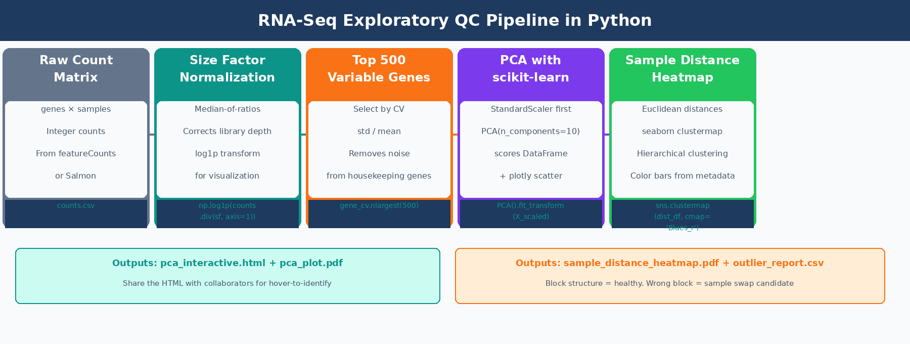
The full workflow is: load and normalize counts, select the most variable genes, run PCA with scikit-learn, plot interactively with plotly, then build a sample distance heatmap with seaborn.clustermap. By the end you have four publication-ready QC figures and a flagged outlier report you can take to a collaborator.
If you want the upstream read-level QC context, pair this with Understanding Your QC Report: What FastQC and MultiQC Are Telling You. If you are starting from the expression matrix itself, What Is a Count Matrix and Why Does It Matter is the quick prerequisite.
Why You Cannot Run PCA on Raw RNA-Seq Counts
Raw counts have a mean-variance dependency that makes PCA meaningless without transformation. A gene with 10,000 counts per sample will have variance in the hundreds simply because large numbers produce large differences. If you run PCA on raw counts, the first principal component separates samples by library size, not by biology.
Two transformations fix this. The variance-stabilizing transformation from DESeq2 is the theoretically rigorous option: it makes variance independent of the mean across the full expression range, so that lowly and highly expressed genes contribute equally to the analysis. For a Python-native workflow without an R dependency, log1p normalization on size-factor-corrected counts is a close practical equivalent and produces essentially identical PCA plots for most bulk datasets.
The standard size factor calculation uses the median-of-ratios method: for each gene, compute the ratio of its count in each sample to its geometric mean across all samples, then take the per-sample median of those ratios. This is the same method DESeq2 uses internally, and it is robust to outlier genes that might otherwise skew a simple library-size scaling.
import pandas as pdimport numpy as npfrom sklearn.preprocessing import StandardScalerfrom sklearn.decomposition import PCAimport plotly.express as pximport seaborn as snsimport matplotlib.pyplot as pltfrom scipy.spatial.distance import pdist, squareform
# counts: genes x samples (standard orientation from featureCounts/Salmon)counts   = pd.read_csv("results/counts/counts.csv", index_col=0)metadata = pd.read_csv("data/sample_metadata.csv", index_col=0, dtype=str)
# Verify alignment: sample order must match in both DataFramesassert list(counts.columns) == list(metadata.index), \    "Column/row order mismatch between counts and metadata"
# ---- Median-of-ratios size factor estimation ----log_counts   = np.log(counts.replace(0, np.nan))          # log of counts, zeros become NaNgene_lmeans  = log_counts.mean(axis=1)                    # per-gene log-geometric-meanvalid        = gene_lmeans.notna() & (counts > 0).all(axis=1)log_ratios   = log_counts.loc[valid].sub(gene_lmeans[valid], axis=0)size_factors = np.exp(log_ratios.median(axis=0))
print("Size factors per sample:")print(size_factors.round(3).to_string())# ctrl_1: 1.032   ctrl_2: 0.978   treat_1: 0.962   treat_2: 1.084
# ---- Normalize and log1p transform ----counts_norm = counts.div(size_factors, axis=1)counts_log  = np.log1p(counts_norm)   # log(x + 1) handles zeros gracefully
print(f"Normalized matrix: {counts_log.shape[0]} genes x {counts_log.shape[1]} samples")
How to Select the Most Variable Genes for PCA
Running PCA on all 20,000 expressed genes dilutes the signal. Housekeeping genes expressed at similar levels across all samples add noise to the distance calculations without adding discriminatory power. The standard approach, and the default used by DESeq2’s plotPCA() function, is to keep the 500 genes with the highest variance across samples after normalization.
Coefficient of variation (standard deviation divided by mean) is a better selection criterion than raw variance because it is scale-independent. A gene with 10,000 mean counts and a standard deviation of 1,000 has the same CV as one with 100 mean counts and a standard deviation of 10, even though the absolute variance differs by two orders of magnitude.
# ---- Select top 500 genes by coefficient of variation ----gene_cv    = counts_log.std(axis=1) / counts_log.mean(axis=1)gene_cv    = gene_cv.replace([np.inf, -np.inf], np.nan).dropna()top_genes  = gene_cv.nlargest(500).indexcounts_top = counts_log.loc[top_genes]
# Transpose: PCA expects samples as rows, genes as columnsX = counts_top.T     # shape: (n_samples, 500)
print(f"PCA input: {X.shape[0]} samples x {X.shape[1]} genes")
How to Run PCA on RNA-Seq Data with scikit-learn and plotly
Before passing the matrix to PCA, StandardScaler subtracts each gene’s mean and divides by its standard deviation. This Z-score normalization ensures every gene contributes equally to the principal components, regardless of its expression level. Without this step, high-expression genes still dominate even after log transformation.
# ---- Standardize and run PCA ----scaler     = StandardScaler()X_scaled   = scaler.fit_transform(X)
n_pcs = min(10, X.shape[0] - 1)pca   = PCA(n_components=n_pcs)pca.fit(X_scaled)
pct_var = pca.explained_variance_ratio_ * 100print("Variance explained:")for i, v in enumerate(pct_var[:5], 1):    print(f"  PC{i}: {v:.1f}%")# PC1: 52.3%   PC2: 18.4%   PC3: 8.1%   PC4: 4.2%   PC5: 2.9%
# Build scores DataFrame and attach metadata for plottingscores = pd.DataFrame(    pca.transform(X_scaled),    index   = X.index,    columns = [f"PC{i}" for i in range(1, n_pcs + 1)]).join(metadata)
Interactive PCA plot with plotly
An interactive plot lets you hover over each point to see the sample name. This is essential for identifying which specific sample is the outlier, not just that one exists.
fig = px.scatter(    scores,    x      = "PC1",    y      = "PC2",    color  = "condition",    symbol = "batch" if "batch" in metadata.columns else None,    text   = scores.index,    color_discrete_map = {"control": "#0d9488", "treated": "#f97316"},    labels = {        "PC1": f"PC1 ({pct_var[0]:.1f}% variance)",        "PC2": f"PC2 ({pct_var[1]:.1f}% variance)"    },    title  = "RNA-seq PCA: top 500 variable genes, log1p normalized")fig.update_traces(    textposition = "top center",    marker       = dict(size=14, opacity=0.85, line=dict(width=1, color="white")))fig.update_layout(plot_bgcolor="white", paper_bgcolor="white")
# Save interactive HTML for sharing with collaboratorsfig.write_html("results/figures/pca_interactive.html")
# Save static PDF for manuscriptsfig.write_image("results/figures/pca_plot.pdf", width=700, height=500)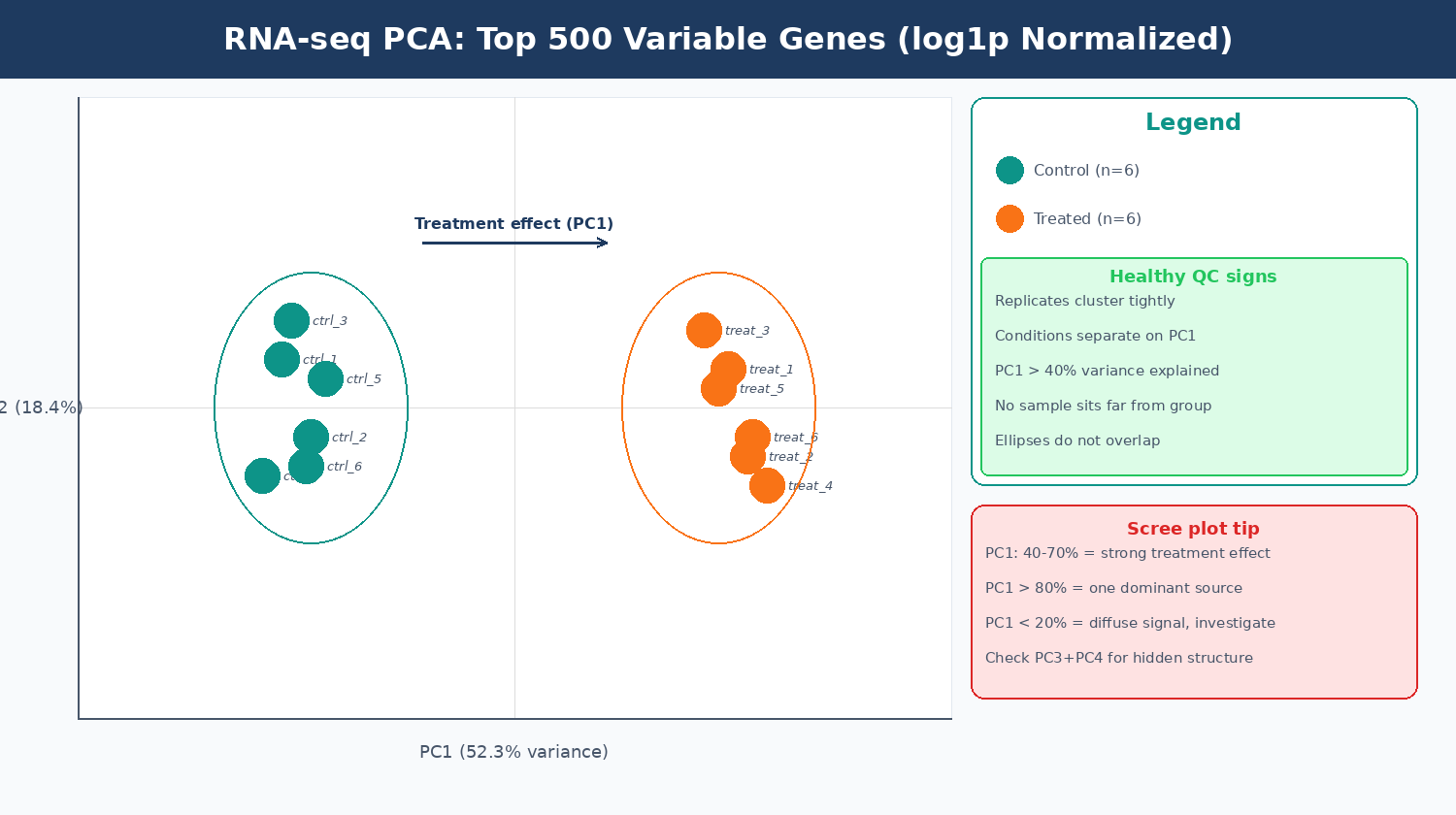
What Batch Effects and Outlier Samples Look Like on a PCA Plot
Exploratory analysis is crucial for quality control. It can help detect quality problems, sample swaps, and contamination, as well as give a sense of the most salient patterns present in the data (Carpentries Bioconductor RNA-seq course). Knowing what bad patterns look like is as important as knowing what a good one looks like.
| PCA Pattern | What It Means | Action |
|---|---|---|
| Replicates cluster tightly, conditions separate on PC1 | Healthy experiment | Proceed with DESeq2 |
| Conditions separate on PC2 or PC3, PC1 is a size gradient | Missing normalization step | Re-normalize before PCA |
| PC1 separates by extraction batch, not condition | Technical batch effect | Add batch to design formula |
| One sample sits far from all others | Outlier sample | Investigate and consider excluding |
| All replicates scattered, no grouping | High biological variance or technical failure | Inspect library QC metrics per sample |
| Treatment groups overlap completely | Treatment had no effect, or wrong sample labels | Verify experimental design |
A standard numerical criterion for flagging outliers: convert PC1 scores to Z-scores and flag samples with absolute Z greater than 3. A sample that falls outside the main group by more than two standard deviations in mean pairwise distance is commonly flagged, though this threshold is still arbitrary. Combine this with visual inspection of the PCA plot and the distance heatmap before making any exclusion decision.
When PC1 is dominated by a technical factor instead of biology, the downstream fix is the same batch-aware design logic discussed in Batch Effects: The Silent Killer of RNA-Seq Studies.
# ---- Quantitative outlier check using PC1 Z-scores ----# Flag samples where |PC1 z-score| > 3 (standard criterion for outliers)pc1_z = (scores["PC1"] - scores["PC1"].mean()) / scores["PC1"].std()
outliers = pc1_z[pc1_z.abs() > 3]if len(outliers) > 0:    print("Potential outliers (|PC1 z-score| > 3):")    print(outliers)else:    print("No outliers detected by PC1 z-score criterion.")
# Also check PC2 for outliers that PC1 missespc2_z = (scores["PC2"] - scores["PC2"].mean()) / scores["PC2"].std()outliers_pc2 = pc2_z[pc2_z.abs() > 3]if len(outliers_pc2) > 0:    print("Potential outliers on PC2:")    print(outliers_pc2)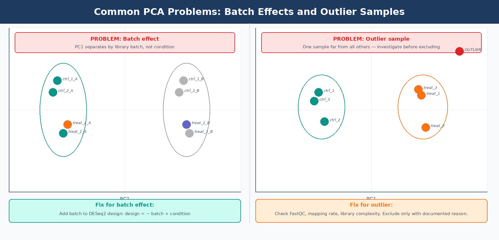
Investigate before removing outliers
A sample outside its group is not automatically a sample to remove. Before excluding any replicate, check its FastQC report, mapping rate, library complexity, and whether it matches the expected biological condition. A sample that failed library prep should be excluded. A sample with genuine biological variance should not be. Document the reason for any exclusion in your methods section.
How to Make a Sample Distance Heatmap with seaborn clustermap
The distance heatmap complements PCA by showing all pairwise distances between samples simultaneously. Biological replicates should show low pairwise distance (dark on a blue-reversed scale) and cluster together on the dendrogram. A sample that does not cluster with its expected group is a much stronger outlier signal than one that simply sits slightly apart on a PCA plot.
# ---- Euclidean distance matrix ----# Use the same log1p-normalized matrix (samples as rows)dist_matrix = squareform(pdist(X.values, metric="euclidean"))dist_df     = pd.DataFrame(dist_matrix, index=X.index, columns=X.index)
# ---- Annotation color bars ----cond_palette  = {"control": "#0d9488", "treated": "#f97316"}row_colors    = metadata["condition"].map(cond_palette).rename("Condition")
# Add batch color bar if batch information is availableif "batch" in metadata.columns:    batch_palette = {"A": "#7c3aed", "B": "#f59e0b"}    batch_colors  = metadata["batch"].map(batch_palette).rename("Batch")    row_colors_df = pd.concat([row_colors, batch_colors], axis=1)else:    row_colors_df = row_colors
# ---- Build the clustered heatmap ----g = sns.clustermap(    dist_df,    cmap             = "Blues_r",   # dark = similar, light = different    row_colors       = row_colors_df,    col_colors       = row_colors_df,    figsize          = (9, 8),    linewidths       = 0.4,    linecolor        = "white",    dendrogram_ratio = 0.15,    method           = "average",   # average linkage hierarchical clustering    cbar_kws         = {"label": "Euclidean distance", "shrink": 0.6})
g.ax_heatmap.set_xlabel("")g.ax_heatmap.set_ylabel("")g.fig.suptitle(    "Sample-to-sample distance matrix (top 500 variable genes)",    y = 1.02, fontsize = 12, fontweight = "bold")
plt.savefig("results/figures/sample_distance_heatmap.pdf",            bbox_inches="tight", dpi=150)plt.savefig("results/figures/sample_distance_heatmap.png",            bbox_inches="tight", dpi=300)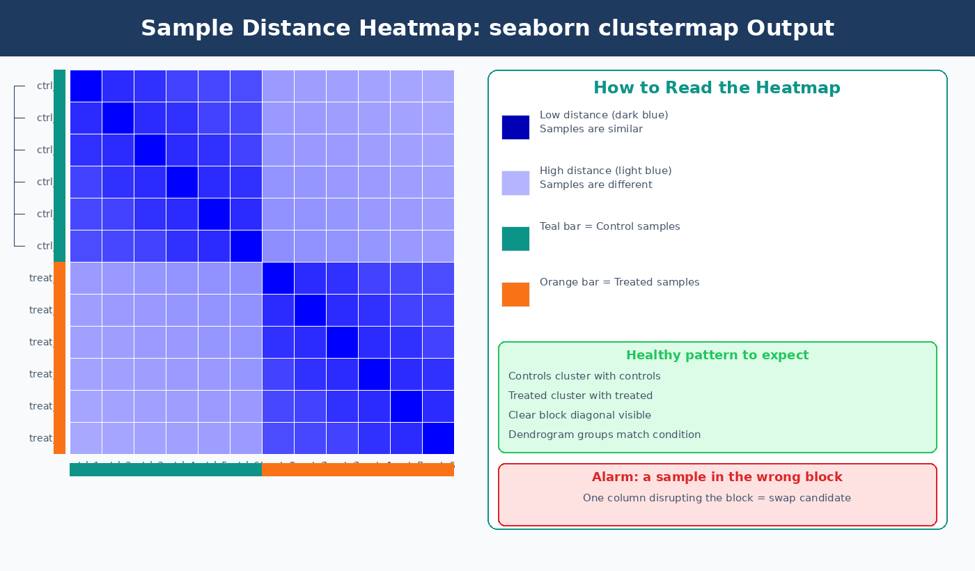
Putting It All Together: A Reusable QC Script
The complete pipeline below generates all four QC outputs in one run. Save it as rna_seq_qc.py and call it before every DESeq2 analysis.
#!/usr/bin/env python3"""rna_seq_qc.py: PCA and distance heatmap QC for bulk RNA-seq."""
import os, pandas as pd, numpy as npfrom sklearn.preprocessing import StandardScalerfrom sklearn.decomposition import PCAimport plotly.express as pximport seaborn as sns, matplotlib.pyplot as pltfrom scipy.spatial.distance import pdist, squareform
os.makedirs("results/figures", exist_ok=True)
# Loadcounts   = pd.read_csv("results/counts/counts.csv", index_col=0)metadata = pd.read_csv("data/sample_metadata.csv", index_col=0, dtype=str)assert list(counts.columns) == list(metadata.index)
# Normalize: median-of-ratios + log1plc   = np.log(counts.replace(0, np.nan))gm   = lc.mean(axis=1)mask = gm.notna() & (counts > 0).all(axis=1)sf   = np.exp(lc.loc[mask].sub(gm[mask], axis=0).median(axis=0))norm = np.log1p(counts.div(sf, axis=1))
# Top 500 variable genescv      = (norm.std(axis=1) / norm.mean(axis=1)).dropna()top500  = cv.nlargest(500).indexX       = norm.loc[top500].T
# PCAX_sc    = StandardScaler().fit_transform(X)pca     = PCA(n_components=min(10, X.shape[0] - 1)).fit(X_sc)pct_var = pca.explained_variance_ratio_ * 100scores  = pd.DataFrame(pca.transform(X_sc), index=X.index,          columns=[f"PC{i}" for i in range(1, pca.n_components_ + 1)]).join(metadata)
# Interactive PCA plotfig = px.scatter(scores, x="PC1", y="PC2", color="condition", text=scores.index,    color_discrete_map={"control": "#0d9488", "treated": "#f97316"},    labels={"PC1": f"PC1 ({pct_var[0]:.1f}%)", "PC2": f"PC2 ({pct_var[1]:.1f}%)"},    title="RNA-seq PCA: top 500 variable genes")fig.update_traces(textposition="top center", marker=dict(size=12))fig.write_html("results/figures/pca_interactive.html")fig.write_image("results/figures/pca_plot.pdf", width=700, height=500)
# Outlier checkz1 = (scores["PC1"] - scores["PC1"].mean()) / scores["PC1"].std()flagged = z1[z1.abs() > 3]print("Outliers (|PC1 z| > 3):", flagged.index.tolist() if len(flagged) else "None")
# Distance heatmapdist_df = pd.DataFrame(squareform(pdist(X.values)), index=X.index, columns=X.index)rc = metadata["condition"].map({"control": "#0d9488", "treated": "#f97316"})g  = sns.clustermap(dist_df, cmap="Blues_r", row_colors=rc, col_colors=rc,                    figsize=(8, 7), method="average")g.fig.suptitle("Sample Distance Matrix", y=1.02)plt.savefig("results/figures/sample_distance_heatmap.pdf", bbox_inches="tight")plt.close()
print("QC complete. Outputs written to results/figures/")
NotchBio runs this QC pipeline automatically on every uploaded count matrix, surfacing the PCA plot, sample distance heatmap, and a flagged outlier table alongside your mapping statistics before differential expression begins. If you want these diagnostics without managing Python environments and package versions, upload your counts at notchbio.app.
Further reading
Read another related post
How to Download RNA-Seq Data from GEO and SRA Using sra-tools and pysradb
Step-by-step tutorial for downloading bulk RNA-seq FASTQ files from GEO and SRA. Covers prefetch, fasterq-dump, pysradb metadata extraction, batch downloads, and fixes for common errors.
TutorialHow to Make Volcano Plots and MA Plots in R: ggplot2 and EnhancedVolcano
Step-by-step R tutorial for publication-quality volcano plots and MA plots from DESeq2 results. Covers ggplot2 from scratch, ggrepel gene labeling, EnhancedVolcano, and plot interpretation.
TutorialDifferential Expression Analysis in Python with PyDESeq2: A Complete Tutorial
Run DESeq2 differential expression analysis entirely in Python using PyDESeq2. Learn DeseqDataSet, DeseqStats, apeglm shrinkage, multi-factor designs, and pandas result filtering.