Publication-Ready RNA-Seq Plots in ggplot2
The gap between a plot that looks fine on your screen and a plot that passes production at a journal is wider than most researchers expect. Font size that reads clearly at screen resolution collapses to illegibility at 89 mm print width. A rainbow color scheme that distinguishes groups on your monitor fails entirely for the 8 percent of male readers who are red-green colorblind. A PNG saved at matplotlib’s default 100 DPI will come back from the production office with a request to resubmit at 300 DPI minimum.
This tutorial covers the three standard RNA-seq figures in almost every differential expression paper: the volcano plot, the heatmap, and the PCA. Every code block produces outputs ready for journal submission on the first attempt. Every aesthetic choice here is grounded in either reproducibility (color scales that survive print and digital) or reviewer expectations (font sizes, axis labels, threshold annotations that inform without cluttering).
Before You Start: Install Required Packages
# Core plottinginstall.packages(c("ggplot2", "ggrepel", "patchwork", "RColorBrewer"))
# Heatmapif (!requireNamespace("BiocManager", quietly = TRUE))  install.packages("BiocManager")BiocManager::install("ComplexHeatmap")install.packages("circlize")     # color mapping for ComplexHeatmap
# Volcano plot (optional wrapper)BiocManager::install("EnhancedVolcano")
# Colorblind-safe palettesinstall.packages("viridis")
The Volcano Plot
A volcano plot maps fold change (x-axis) against statistical significance (y-axis) for every tested gene. The word “volcano” comes from the shape: a dense base of non-significant genes narrows into two arms of significant genes at the upper corners. A well-made volcano communicates three things instantly: the overall magnitude of the transcriptional response, the balance between up and down regulation, and which specific genes are the most prominent hits.
The most common problems with published volcano plots are: using raw p-values on the y-axis instead of adjusted p-values, omitting threshold lines so readers cannot tell where significance begins, and either over-labeling (every gene gets a label, creating an unreadable mass) or under-labeling (no labels, so readers cannot identify hits without consulting a supplementary table).
library(ggplot2)library(ggrepel)library(dplyr)
# Assume res_df is your DESeq2 results data frame with columns:# gene_name, log2FoldChange, padj (from lfcShrink output)res_df <- as.data.frame(res_shrunk) |>  tibble::rownames_to_column("ensembl_id") |>  dplyr::filter(!is.na(padj))
# Classify genes for color codingres_df <- res_df |>  dplyr::mutate(    direction = dplyr::case_when(      padj < 0.05 & log2FoldChange >= 1  ~ "up",      padj < 0.05 & log2FoldChange <= -1 ~ "down",      TRUE                                ~ "ns"    ),    # Cap -log10(padj) so extreme values do not distort the y-axis    neg_log10_padj = pmin(-log10(padj), 30)  )
# Genes to label: top 15 by significance, among significant hits onlytop_genes <- res_df |>  dplyr::filter(direction != "ns") |>  dplyr::slice_min(padj, n = 15)
# Counts for subtitle annotationn_up   <- sum(res_df$direction == "up")n_down <- sum(res_df$direction == "down")
# Plotvolcano <- ggplot(res_df, aes(x = log2FoldChange, y = neg_log10_padj,                               color = direction)) +  geom_point(size = 0.8, alpha = 0.6) +  # Threshold lines  geom_hline(yintercept = -log10(0.05), linetype = "dashed",             color = "grey40", linewidth = 0.4) +  geom_vline(xintercept = c(-1, 1), linetype = "dashed",             color = "grey40", linewidth = 0.4) +  # Gene labels with repulsion to avoid overlap  ggrepel::geom_text_repel(    data          = top_genes,    aes(label     = gene_name),    size          = 2.5,    max.overlaps  = 20,    segment.size  = 0.2,    segment.color = "grey60",    color         = "black",    show.legend   = FALSE  ) +  # Colorblind-safe palette: blue/red/grey  scale_color_manual(    values = c(up = "#CC3311", down = "#0077BB", ns = "#BBBBBB"),    labels = c(up   = paste0("Up (", n_up, ")"),               down = paste0("Down (", n_down, ")"),               ns   = "NS"),    name   = NULL  ) +  scale_x_continuous(limits = c(-5, 5), breaks = seq(-4, 4, 2)) +  scale_y_continuous(limits = c(0, 31)) +  labs(    x        = expression(Log[2]~"fold change"),    y        = expression(-Log[10]~"adjusted p-value"),    title    = "Treated vs Control",    subtitle = paste0("DESeq2 with apeglm shrinkage | padj < 0.05 | |log2FC| >= 1")  ) +  theme_classic(base_size = 10) +  theme(    legend.position  = "top",    legend.text      = element_text(size = 8),    plot.title       = element_text(size = 11, face = "bold"),    plot.subtitle    = element_text(size = 8, color = "grey40"),    axis.title       = element_text(size = 9),    axis.text        = element_text(size = 8)  )
volcano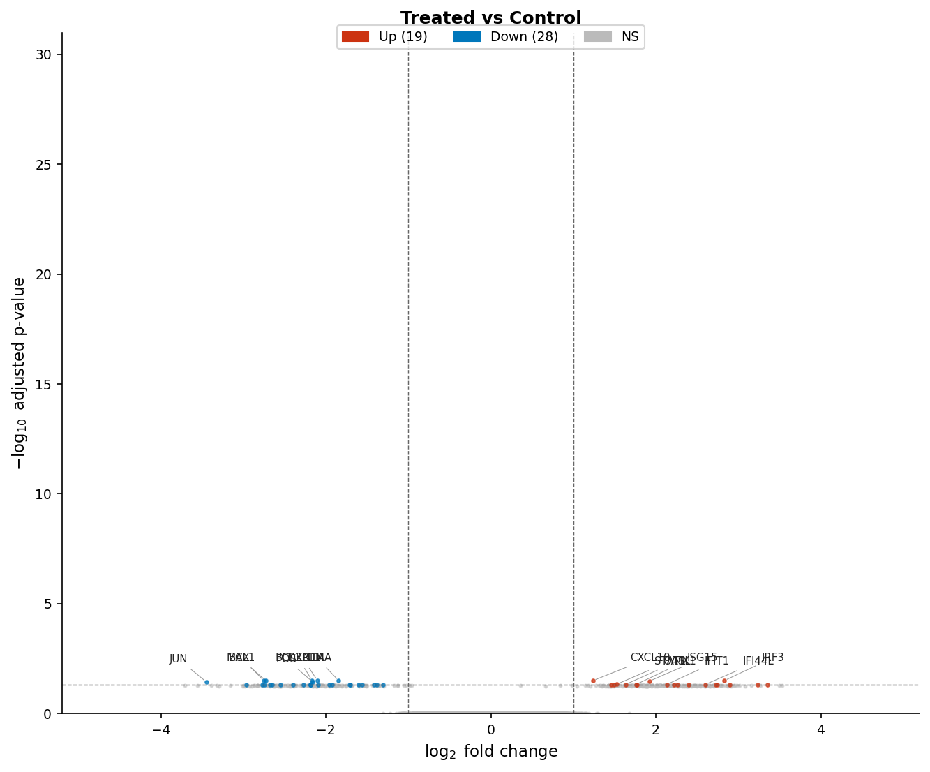
The Heatmap
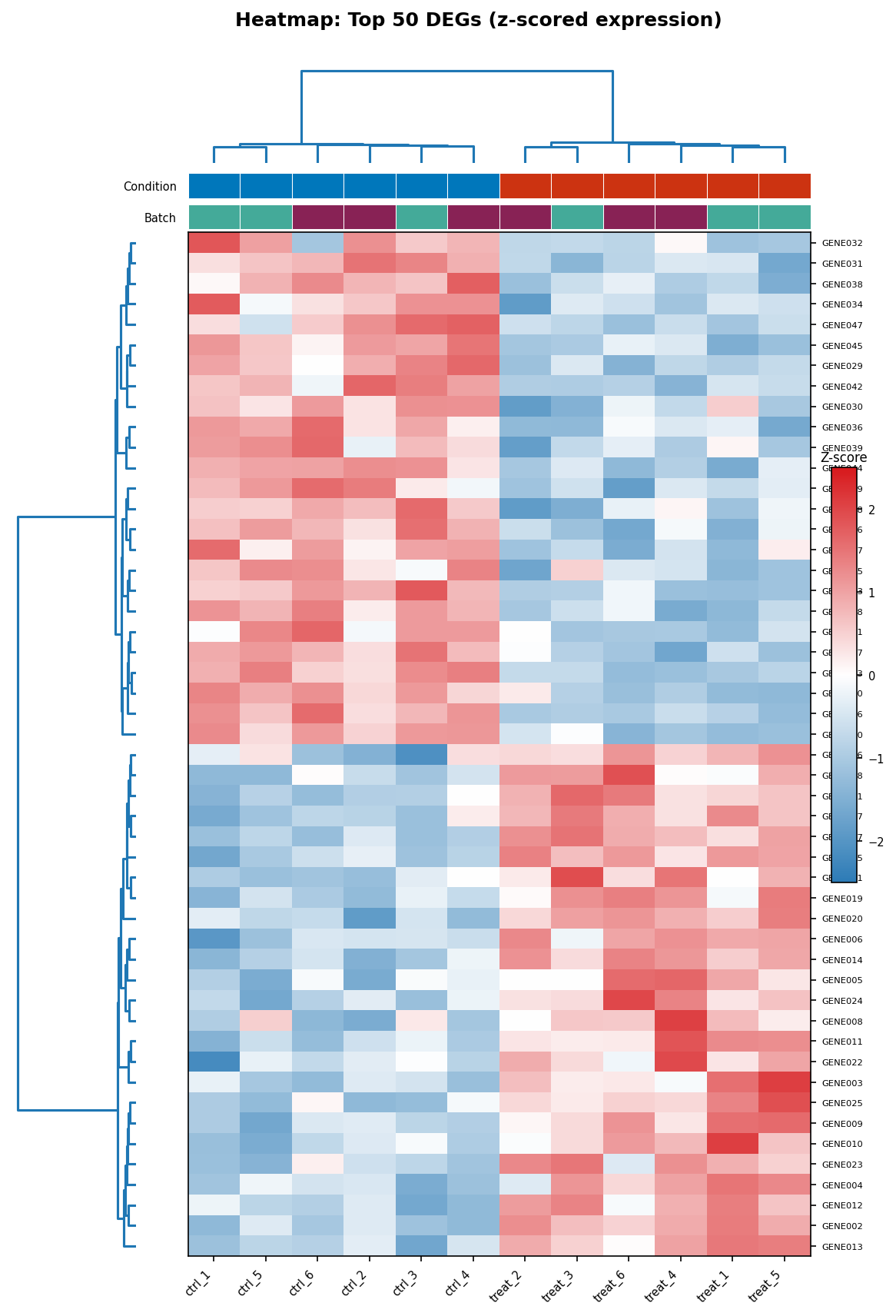
The heatmap shows expression across samples for a selected set of genes, typically the top DEGs. The critical pre-processing step is z-score scaling across rows (genes): without this, highly expressed genes will dominate the color scale and low-expressed genes will all appear the same color regardless of their pattern.
ComplexHeatmap by Zuguang Gu is the standard for publication-quality heatmaps in R. It produces outputs that are significantly cleaner than pheatmap with more control over annotation bars, clustering parameters, and color scaling.
library(ComplexHeatmap)library(circlize)library(viridis)
# Subset to top 50 DEGs by adjusted p-valuetop50_ids <- res_df |>  dplyr::filter(direction != "ns") |>  dplyr::slice_min(padj, n = 50) |>  dplyr::pull(ensembl_id)
# Extract normalized counts for these genes# vsd is your variance-stabilized DESeqDataSetheatmap_mat <- assay(vsd)[top50_ids, ]
# Z-score scale each row (gene) across samples# This makes the color represent relative expression, not absolute levelheatmap_scaled <- t(scale(t(heatmap_mat)))
# Define annotation bars for columns (samples)col_annotation <- HeatmapAnnotation(  Condition = metadata$condition,  Batch     = metadata$batch,        # include if batch was modeled  col       = list(    Condition = c(control = "#0077BB", treated = "#CC3311"),    Batch     = c(batch1  = "#44AA99", batch2  = "#882255")  ),  annotation_name_side = "left")
# Color scale: viridis-based diverging for z-scorescol_fun <- colorRamp2(  breaks = c(-2, 0, 2),  colors = c("#2C7BB6", "white", "#D7191C"))
# Draw the heatmaphm <- Heatmap(  matrix            = heatmap_scaled,  name              = "Z-score",  col               = col_fun,  top_annotation    = col_annotation,  cluster_rows      = TRUE,  cluster_columns   = TRUE,  clustering_method_rows    = "ward.D2",  clustering_method_columns = "ward.D2",  clustering_distance_rows    = "euclidean",  clustering_distance_columns = "euclidean",  show_row_names    = TRUE,  show_column_names = TRUE,  row_names_gp      = gpar(fontsize = 7),  column_names_gp   = gpar(fontsize = 8),  row_names_side    = "right",  heatmap_legend_param = list(    title          = "Z-score",    legend_height  = unit(3, "cm"),    at             = c(-2, -1, 0, 1, 2)  ))
draw(hm)
Never use a rainbow color scale for heatmaps
The rainbow color scale (jet, hsv, or any red-green gradient) creates two problems simultaneously. First, it implies a non-monotonic perceptual mapping: the transition from blue to cyan appears less dramatic than the transition from yellow to red, even when the underlying data difference is identical. Second, it fails completely for colorblind readers who cannot distinguish red from green. Use diverging palettes (RdBu, PuOr) for z-scored data centered at zero, or sequential palettes (viridis, Blues, Reds) for data with a meaningful floor. The viridis family is colorblind-safe and perceptually uniform by design.
The PCA Plot
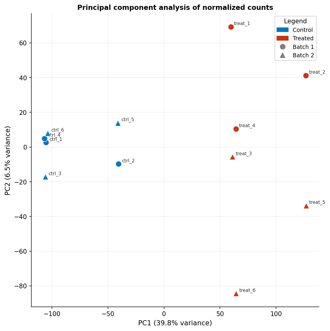
The PCA plot is often treated as a diagnostic rather than a publishable figure, but it is a primary figure in many RNA-seq papers when it clearly separates conditions. The critical element most published PCA plots omit is the variance explained by each principal component on the axis labels. “PC1” and “PC2” mean nothing to a reader; “PC1 (43% variance)” tells them how much of the transcriptional variation the plot is capturing.
library(ggplot2)library(ggrepel)library(DESeq2)
# Compute PCA from VST-transformed countspca_res    <- prcomp(t(assay(vsd)), scale. = FALSE)pca_df     <- as.data.frame(pca_res$x[, 1:2])pca_df$sample    <- rownames(pca_df)pca_df$condition <- metadata$conditionpca_df$batch     <- metadata$batch
# Variance explainedvar_exp <- round(100 * pca_res$sdev^2 / sum(pca_res$sdev^2), 1)
pca_plot <- ggplot(pca_df, aes(x = PC1, y = PC2,                                color = condition, shape = batch,                                label = sample)) +  geom_point(size = 3.5, stroke = 0.5) +  ggrepel::geom_text_repel(size = 2.2, segment.size = 0.2,                            segment.color = "grey60", color = "black",                            show.legend = FALSE) +  scale_color_manual(    values = c(control = "#0077BB", treated = "#CC3311"),    name   = "Condition"  ) +  scale_shape_manual(    values = c(batch1 = 16, batch2 = 17),   # filled circle and triangle    name   = "Batch"  ) +  labs(    x     = paste0("PC1 (", var_exp[1], "% variance)"),    y     = paste0("PC2 (", var_exp[2], "% variance)"),    title = "Principal component analysis of normalized counts"  ) +  theme_classic(base_size = 10) +  theme(    legend.position = "right",    legend.text     = element_text(size = 8),    legend.title    = element_text(size = 9, face = "bold"),    axis.title      = element_text(size = 9),    axis.text       = element_text(size = 8),    plot.title      = element_text(size = 10, face = "bold")  ) +  coord_fixed()    # equal aspect ratio preserves relative variance representation
pca_plot
The coord_fixed() call ensures the scaling of PC1 and PC2 axes is equal, which matters when both explain similar amounts of variance. If PC1 explains 60 percent and PC2 explains 5 percent, omit coord_fixed() to avoid a very wide, flat plot that obscures the PC2 structure.
Color Palettes That Work in Print and for Colorblind Readers
The palette choices in the code above are not arbitrary. The red-blue pair (#CC3311 and #0077BB) comes from the Paul Tol colorblind-safe palette, which is perceptually distinct under all common forms of color vision deficiency. The viridis diverging scale used in the heatmap is mathematically optimized to be perceptually uniform and distinguishable in grayscale.
Do not use ggplot2’s default scale_color_discrete() palette when red and green appear in the same plot: roughly 8 percent of male readers cannot distinguish them. Do not use the rainbow or jet palette for any continuous data. Do not use light yellow or light grey as one of two categorical colors: these do not survive printing or photocopying.
Safe choices for RNA-seq:
- Two categories (treated/control):
#CC3311(red) and#0077BB(blue) - Three categories: add
#CCBB44(yellow) from the Tol palette - Sequential data (expression level):
viridis,magma, orBlues - Diverging data (fold change, z-score):
RdBufrom RColorBrewer, or blue-white-red custom as shown
Exporting at the Right DPI for Journals
Export your figures at the correct resolution from the start. Upscaling a low-resolution raster image does not add detail; it only makes the file larger and blurrier.
| Journal family | Column width (single) | Column width (full page) | Minimum DPI | Preferred format | Font |
|---|---|---|---|---|---|
| Nature | 89 mm | 183 mm | 300 (halftone), 1000 (line art) | TIFF, PDF, EPS | Helvetica/Arial |
| Science | 57 mm | 121 mm | 300 | TIFF, EPS | Times New Roman |
| Cell Press | 85 mm | 175 mm | 300 (photos), 600 (combination) | TIFF, EPS | Avenir |
| PLOS ONE | 83.4 mm | 171 mm | 300 | TIFF, EPS, PDF | Any sans-serif |
| Genome Biology | 85 mm | 170 mm | 300 | TIFF, PDF | Any sans-serif |
| Nucleic Acids Research | 82.5 mm | 171 mm | 300 | TIFF, EPS | Any sans-serif |
| Bioinformatics (OUP) | 83.4 mm | 171 mm | 300 | TIFF, EPS | Any sans-serif |
For data visualization plots (scatter, heatmap, PCA), submit as PDF or SVG wherever the journal accepts them. Vector formats are resolution-independent and look identical at any print size. Use TIFF at 300 DPI only when the journal explicitly requires raster files or when your plot contains a raster element (for example, a confocal image embedded in a composite figure).
# Export for Nature (single column: 89mm wide, 300 DPI)ggsave(  filename = "volcano_nature.pdf",  plot     = volcano,  width    = 89,  height   = 89,          # adjust height to your figure's aspect ratio  units    = "mm",  device   = cairo_pdf    # embeds fonts correctly in PDF)
# Export as high-resolution TIFF (when raster required)ggsave(  filename = "volcano_nature.tiff",  plot     = volcano,  width    = 89,  height   = 89,  units    = "mm",  dpi      = 600,          # 600 for combination figures (data + annotation)  compression = "lzw"     # lossless TIFF compression)
# ComplexHeatmap must be exported differently than ggplot2pdf("heatmap_nature.pdf", width = 89/25.4, height = 120/25.4)draw(hm)dev.off()
Use cairo_pdf rather than the default pdf device when your plot contains non-standard fonts or Unicode characters in gene names. It embeds fonts correctly and avoids the “font not embedded” error that some journal production systems raise.
NotchBio generates all three of these plot types automatically for every run and provides them as downloadable PDF and SVG files ready for journal submission. The color palettes are colorblind-safe by default, the axis labels include variance explained for the PCA, and the export dimensions match the single-column width for Nature, Cell, and PLOS. If you need a different column width or format, the raw data tables are also downloadable so you can reproduce any plot in R with the code from this tutorial.
Related Reading
Further reading
Read another related post
Bulk RNA-Seq for Bacteria: Operons and Why nf-core Breaks
Most bulk RNA-seq pipelines fail silently on bacterial data. Here is what changes for operons, GTF feature mismatches, and DE analysis in prokaryotes.
Research GuideThe One-Bioinformatician Problem: Stop Being The Bottleneck
If you are the only bioinformatician serving multiple PIs, you are the bottleneck. Here is how to scale with templates, self-service, and clear handoffs.
TutorialORA vs GSEA: A Side-by-Side Tutorial in R with clusterProfiler
ORA and GSEA answer different questions. A working clusterProfiler tutorial with FDR correction, proper backgrounds, and side-by-side result interpretation.