From Count Matrix to Volcano Plot: A DESeq2 Walkthrough in R
The count matrix lands in your inbox. Rows are genes, columns are samples, values are integers representing how many reads mapped to each gene in each sample. Your PI wants a list of differentially expressed genes and a volcano plot by Friday. You have DESeq2 installed and a rough memory of the vignette.
This tutorial walks you through the entire process without shortcuts: loading the count matrix, building the metadata table, constructing the design formula, running the statistical test, shrinking fold change estimates, generating the volcano plot, and exporting results for enrichment analysis. Every code block runs. Every parameter choice is explained.
The dataset used throughout is a synthetic but realistic paired-end RNA-seq experiment comparing a treated cell line to an untreated control, with three biological replicates per condition.
Before You Start
Install the required packages if you have not already. All of these are available through Bioconductor or CRAN.
if (!requireNamespace("BiocManager", quietly = TRUE))    install.packages("BiocManager")
BiocManager::install(c("DESeq2", "apeglm", "EnhancedVolcano"))install.packages(c("dplyr", "tibble"))
Your count matrix must contain raw integer counts, not normalized values. Do not use TPM, FPKM, or CPM as input to DESeq2. Those normalizations are appropriate for some visualization purposes but are statistically incompatible with the negative binomial model DESeq2 uses for inference. If your counts come from Salmon or kallisto, import them with tximport before building the DESeqDataSet.
Step 1: Load the Count Matrix and Metadata
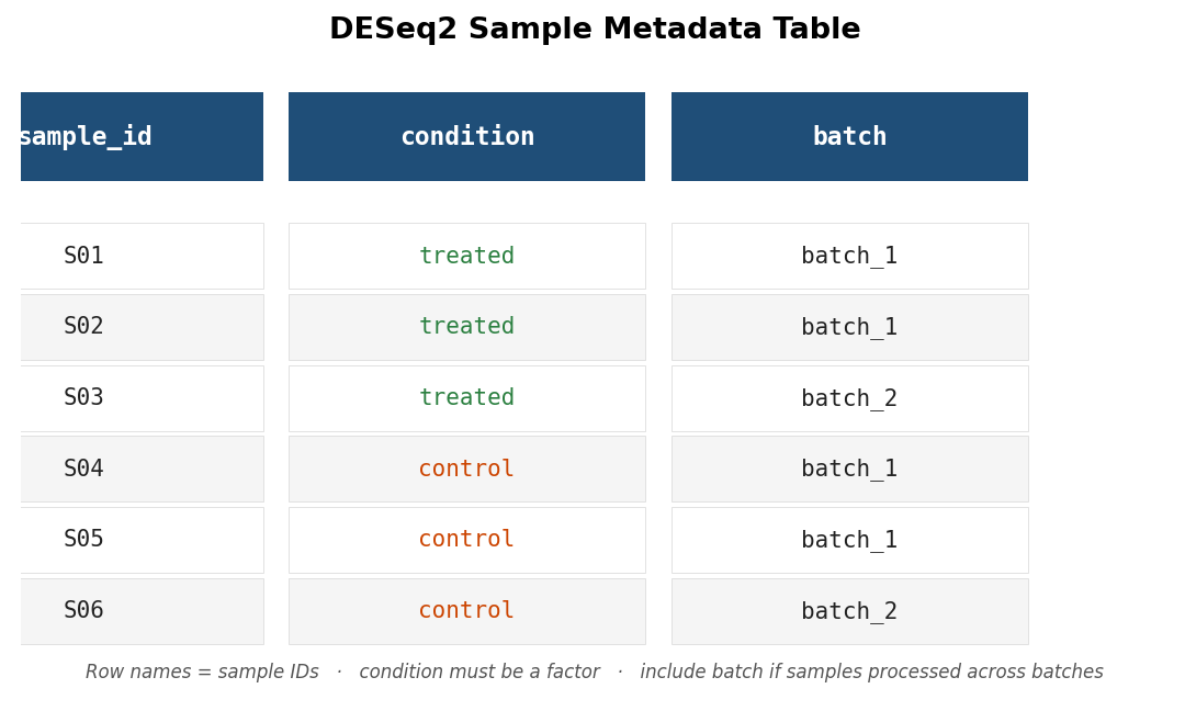
Your count matrix should be a plain integer matrix or data frame where row names are gene identifiers (Ensembl IDs or gene symbols) and column names are sample IDs. The metadata table has one row per sample and at minimum a column mapping each sample ID to its condition.
library(DESeq2)library(dplyr)
# Load the raw count matrix# Rows = genes, columns = samples# Values must be raw integers, not TPM or FPKMcounts <- read.csv("counts_matrix.csv",                   row.names = 1,                   check.names = FALSE)
# Load the sample metadatametadata <- read.csv("sample_metadata.csv",                     row.names = 1)
# Critical sanity check: column names of counts must match row names of metadata# in exactly the same orderall(colnames(counts) == rownames(metadata))
If that last line returns FALSE, stop here. Mismatched sample order is the most common mistake in DESeq2 setup and silently produces wrong results because the package trusts that column order is consistent between the count matrix and the metadata. Fix the order before proceeding.
# If column order is wrong, reorder metadata to match countsmetadata <- metadata[colnames(counts), , drop = FALSE]
# Verifystopifnot(all(colnames(counts) == rownames(metadata)))
Your metadata should look roughly like this before proceeding:
Step 2: Build the DESeqDataSet
The DESeqDataSet object is the input to all DESeq2 functions. It combines the count matrix, the metadata, and the design formula.
# Ensure condition is a factor with the reference level set explicitly# The reference level is the denominator in your fold change calculation# (usually "control" or "untreated")metadata$condition <- factor(metadata$condition,                              levels = c("control", "treated"))
# Build the DESeqDataSetdds <- DESeqDataSetFromMatrix(  countData = counts,  colData   = metadata,  design    = ~ condition     # simplest two-condition design)
# Pre-filter: remove genes with fewer than 10 counts across all samples# This reduces the number of statistical tests and speeds up computationkeep <- rowSums(counts(dds)) >= 10dds  <- dds[keep, ]
cat("Genes after filtering:", nrow(dds), "\n")
The levels argument in factor() controls which condition is the reference. If you omit it, R uses alphabetical order, which puts “control” before “treated” by coincidence here but may give you the wrong reference level in other experiments. Set it explicitly every time.
Include batch in your design formula if samples were batched
If your samples were processed across multiple batches, the design formula must include batch as a covariate: design = ~ batch + condition. A two-condition design with unmodeled batch effects inflates your false discovery rate and can produce spurious DEGs driven by batch rather than biology. Add the batch column to your metadata before building the DESeqDataSet and include it in the formula. The condition term must come last.
Step 3: Run DESeq() and Understand the Output
The DESeq() function estimates size factors (normalization), estimates gene-wise dispersions, fits a negative binomial GLM, and runs the Wald test for each gene. It does all of this in one call.
# Run the full DESeq2 pipelinedds <- DESeq(dds)
# Extract results for the contrast of interest# contrast = c("factor", "numerator", "denominator")res <- results(dds,               contrast = c("condition", "treated", "control"),               alpha    = 0.05)
summary(res)
The summary() output tells you how many genes are up and down at padj < 0.05. It also reports how many genes were excluded from testing because of low counts, and how many had padj set to NA by the independent filtering step that DESeq2 runs automatically. Both numbers are worth checking before you interpret any results.
Before you interpret any gene list, check the MA plot. The MA plot is one of the most useful diagnostics in the DESeq2 workflow and is almost always skipped by beginners.
# MA plot: x-axis = mean expression, y-axis = log2 fold change# Red points are significant at padj < 0.05plotMA(res, ylim = c(-5, 5))An MA plot with a healthy analysis looks like a roughly symmetric cloud of grey points centered around zero on the y-axis, with red points scattered at both extremes. If the cloud is noticeably shifted up or down, your size factor normalization may not have worked correctly. If the red points cluster only at one end of the x-axis (very high or very low mean expression), investigate why.
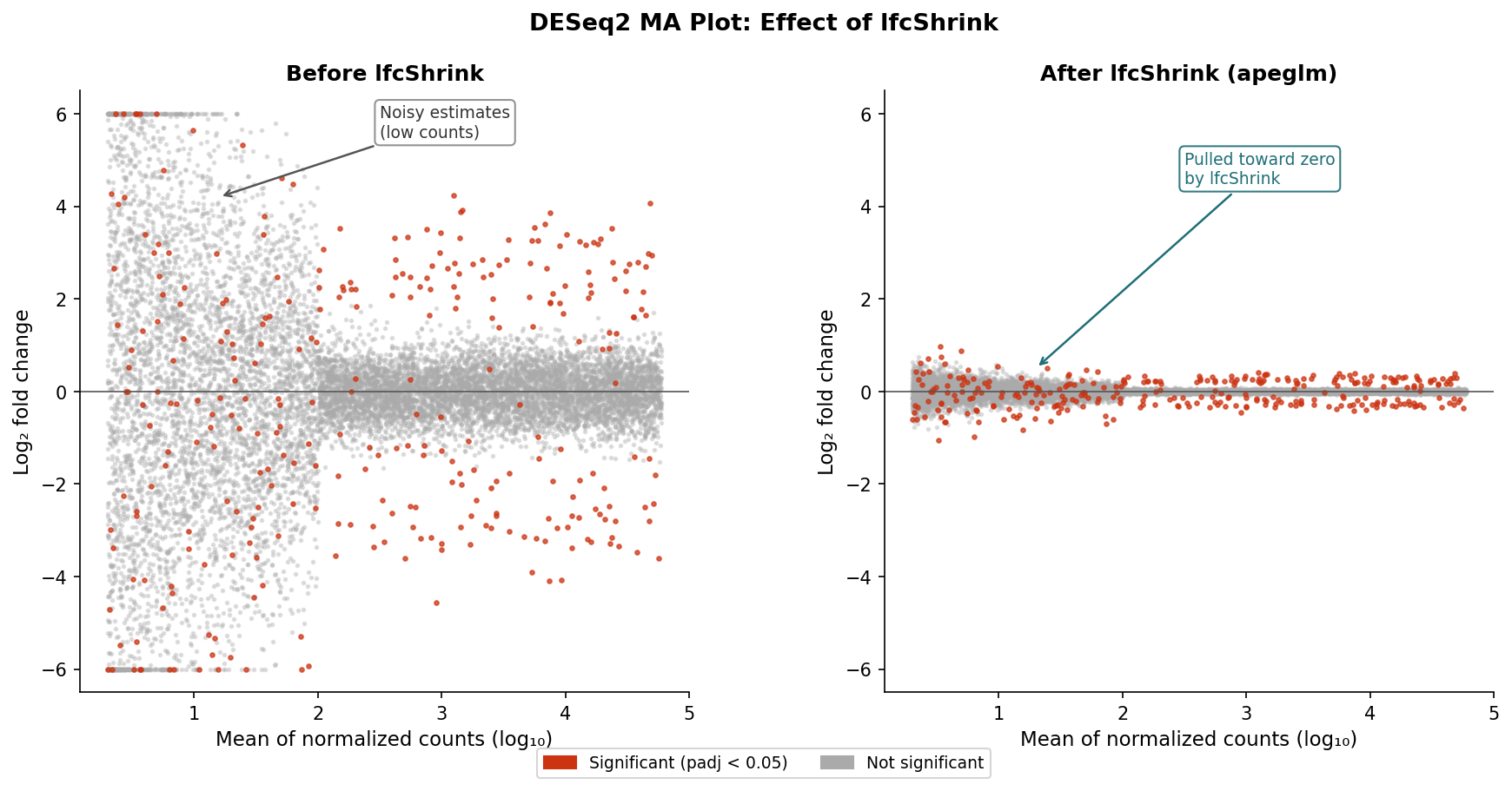
Step 4: Apply lfcShrink
Raw DESeq2 fold change estimates are unreliable for lowly expressed genes because the count data is sparse and noisy. lfcShrink applies an empirical Bayes shrinkage that pulls those estimates toward zero proportional to their uncertainty, producing fold changes that better reflect the actual precision of the data.
library(apeglm)
# Apply lfcShrink using the apeglm estimator# The coef argument must match one of the names in resultsNames(dds)resultsNames(dds)   # Check available coefficient names
res_shrunk <- lfcShrink(dds,                         coef = "condition_treated_vs_control",                         type = "apeglm")
# Compare raw vs shrunken fold changes for a few genescbind(  raw      = res$log2FoldChange[1:5],  shrunken = res_shrunk$log2FoldChange[1:5])
The shrunken fold changes are the ones you should use for filtering, ranking, and visualization. The padj values are unchanged by shrinkage: statistical significance is determined before lfcShrink runs.
Step 5: Filter DEGs and Understand the Output Columns
# Convert results to a data frame and filter DEGsdeg_df <- as.data.frame(res_shrunk) %>%  tibble::rownames_to_column("gene_id") %>%  filter(!is.na(padj),              # remove genes DESeq2 could not test         padj < 0.05,               # adjusted p-value threshold         abs(log2FoldChange) >= 1)  # twofold change threshold
# How many DEGs?cat("DEGs up:  ", sum(deg_df$log2FoldChange > 0), "\n")cat("DEGs down:", sum(deg_df$log2FoldChange < 0), "\n")
Every column in the res_shrunk output object has a specific meaning. Knowing them prevents misinterpretation:
| Column | What it means | Use for |
|---|---|---|
| baseMean | Average normalized count across all samples | Identifying lowly vs highly expressed genes |
| log2FoldChange | Shrunken log2(treated / control) | Filtering on effect size; volcano plot x-axis |
| lfcSE | Standard error of the shrunken log2FC estimate | Assessing estimation uncertainty |
| stat | Wald statistic (unshrunken LFC / SE) | Ranking genes for GSEA input |
| pvalue | Raw p-value from the Wald test | Diagnostics only; never threshold on this |
| padj | Benjamini-Hochberg adjusted p-value | DEG filtering; volcano plot y-axis |
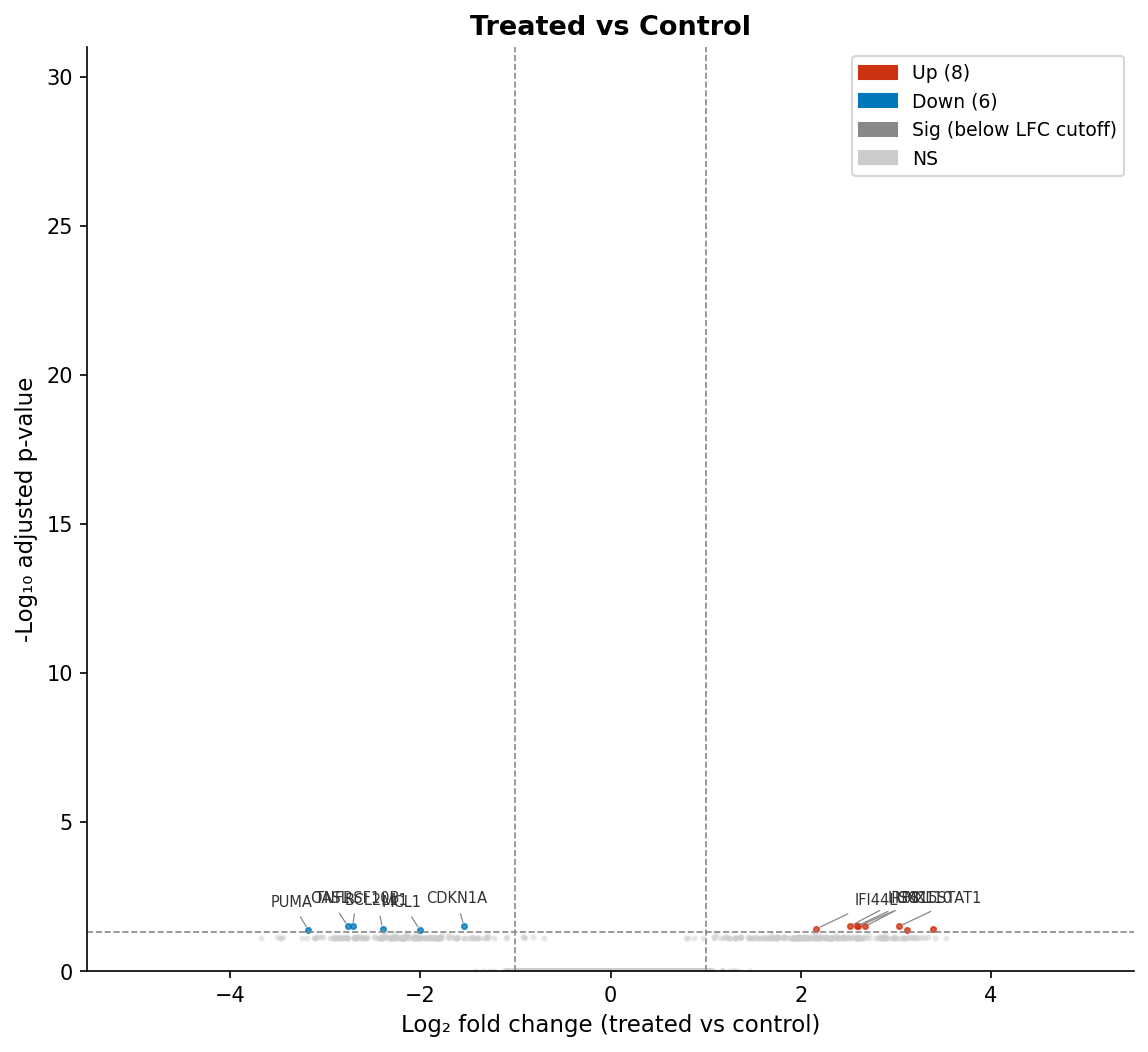
Step 6: Volcano Plot with EnhancedVolcano
The volcano plot is the standard visualization for differential expression results. The x-axis is log2 fold change; the y-axis is negative log10 of the adjusted p-value. Genes in the upper left and upper right corners are both statistically significant and have large fold changes.
library(EnhancedVolcano)
EnhancedVolcano(res_shrunk,  lab            = rownames(res_shrunk),  x              = "log2FoldChange",  y              = "padj",             # use padj, not pvalue  pCutoff        = 0.05,  FCcutoff       = 1,  xlim           = c(-5, 5),  ylim           = c(0, 30),  title          = "Treated vs Control",  subtitle       = "DESeq2 with apeglm shrinkage",  caption        = paste0("Total DEGs: ", nrow(deg_df)),  legendPosition = "right",  drawConnectors = TRUE,  widthConnectors = 0.5)
Pass y = "padj" explicitly. EnhancedVolcano defaults to pvalue if you do not specify, which produces a plot that looks fine but is comparing against raw p-values rather than adjusted ones.
Step 7: Export Results for Downstream Analysis
Before handing your results to an enrichment analysis tool, export two things: the full results table (all genes with non-NA padj) and the filtered DEG list.
# Full results table: used as the background for ORA# and as the ranked input for GSEAfull_results <- as.data.frame(res_shrunk) %>%  tibble::rownames_to_column("gene_id") %>%  filter(!is.na(padj)) %>%  arrange(padj)
write.csv(full_results,          "deseq2_full_results.csv",          row.names = FALSE)
# DEG list: significant genes onlywrite.csv(deg_df,          "deseq2_degs.csv",          row.names = FALSE)
# Ranked gene list for GSEA: all tested genes sorted by Wald stat# Use the stat column from the UNSHRUNKEN results (res, not res_shrunk)# The Wald statistic is the correct ranking metric for gseGO / fgseagsea_ranked <- res %>%  as.data.frame() %>%  tibble::rownames_to_column("gene_id") %>%  filter(!is.na(stat)) %>%  arrange(desc(stat)) %>%  select(gene_id, stat)
write.csv(gsea_ranked,          "gsea_ranked_genes.csv",          row.names = FALSE)
A note on the GSEA ranked list: use the stat column from the unshrunken res object, not the log2FoldChange from res_shrunk. The Wald statistic combines effect size and precision into a single ranking metric and is the standard input for gseGO and fgsea. The shrunken fold change is appropriate for effect size interpretation and volcano plots, but not for GSEA ranking.
What Comes Next
You now have a filtered DEG list, a full results table with Wald statistics, and a volcano plot. The next steps are enrichment analysis (ORA with clusterProfiler using the DEG list and full results as background, GSEA using the Wald-statistic ranking) and visualization (heatmap of the top DEGs, PCA plot colored by condition to confirm group separation).
If you want to run this entire pipeline without writing the code yourself, NotchBio takes a count matrix and sample metadata as inputs and returns the full DESeq2 results, shrunken fold changes, volcano plot, MA plot, and an enrichment analysis summary. The run produces a locked record of every parameter used, which is what you need for your methods section.
Related Reading
Further reading
Read another related post
Why Cell Line RNA-Seq Experiments Fail
Passage drift, undetected mycoplasma, serum lot changes, and pseudoreplication silently corrupt cell line RNA-seq. What each looks like and how to prevent it.
Research GuideSTAR vs HISAT2 vs Salmon: Which Aligner Should You Use?
STAR aligns to the genome, HISAT2 uses less memory, Salmon skips alignment. What each approach means for your RNA-seq results and when each is the right call.
Research GuideWhat Is GSEA and Why Does It Beat a Simple DEG List
How GSEA finds coordinated pathway signals a DEG list misses: how the algorithm works, what NES and the leading edge mean, and how to run it with fgsea in R.